Improving Ecommerce Conversion Rates Guide
Improving your ecommerce conversion rate is all about turning browsers into buyers. The math is simple: take your total number of sales, divide it by your total website visitors, and multiply by 100. That single number tells you almost everything you need to know about the health of your online store.
Think of it as your store's pulse. A strong, steady conversion rate means you're giving customers what they want. A weak one is a clear sign that something needs fixing.
Understanding What Drives Your Conversion Rate
Before you can start making improvements, you have to get a handle on the forces that shape that number. It’s not just an abstract metric; it’s a direct reflection of your customer experience, how appealing your products are, and whether people trust your brand.
Several core elements are always at play. These aren't just separate factors—they all work together to convince a visitor to either hit "buy" or click away.
- User Experience (UX): Is your site easy to navigate? Is it fast? Any confusion or clunkiness creates friction that will send potential customers running.
- Product Presentation: How you show off your products is a massive deal. We're talking about everything from the quality of your photography to how well your descriptions answer a customer's questions.
- Trust and Credibility: People are naturally skeptical online. They’re constantly looking for signals—like reviews, security badges, and clear contact info—that tell them you’re a legitimate business.
- Price and Value Proposition: Your pricing has to feel right for what you're offering. This isn’t just about the sticker price; it includes shipping costs, return policies, and any promotions you’re running.
Set Realistic Goals By Benchmarking
One of the biggest mistakes I see is store owners comparing their numbers to the wrong businesses. While the global average ecommerce conversion rate hovers between 2% and 4%, that number is almost meaningless without context.
Different industries have completely different standards. For example, a business selling low-cost, everyday items like personal care products might see a conversion rate around 6.8%. On the other hand, a store selling high-ticket items with a longer decision-making process, like home decor (1.4%) or jewelry (1.9%), will naturally have lower rates.
Your goal shouldn't be to hit some universal "good" number. It's about consistently improving on your own performance. A 1.5% conversion rate for a luxury furniture brand could be fantastic, while 3% for a fast-fashion store might signal there's room to grow.
To help you see where you stand, here’s a quick look at average conversion rates across a few key sectors.
Ecommerce Conversion Rate Benchmarks by Industry
This table gives you a general idea of what to expect in different markets. Use it to gauge your own performance, but remember that your own historical data is your most important benchmark.
| Industry | Average Conversion Rate |
|---|---|
| Food & Beverage | 4.9% |
| Health & Beauty | 3.3% |
| Fashion & Apparel | 2.4% |
| Home & Garden | 1.8% |
| Luxury Goods | 1.1% |
Data compiled from various industry reports.
Again, these are just averages. The real magic happens when you start digging into your own store’s data to find opportunities for improvement.
Track the Right Metrics to Find the Real Problems
To get a truly clear picture of what's happening, you need to look beyond that one top-level conversion rate. A few other Key Performance Indicators (KPIs) can act like diagnostic tools, helping you pinpoint exactly where you’re losing customers.
Start by getting familiar with these three:
- Cart Abandonment Rate: This is the percentage of people who add items to their cart but bail before paying. A high rate here often points to problems in your checkout process—maybe it's a surprise shipping fee or a form that’s just too complicated.
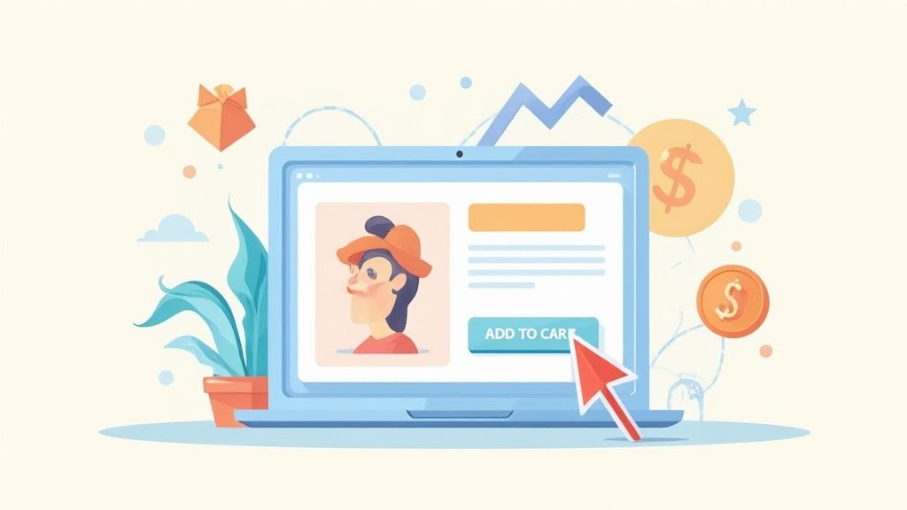
- Add to Cart Rate: This tells you how many visitors actually put a product in their cart. If this number is low, your product pages probably aren't doing their job. The culprit could be weak product descriptions, confusing pricing, or—more often than not—poor-quality images. Seriously, visuals are everything. For a complete walkthrough, check out our guide on how to take professional product photos.
- Bounce Rate: This is the percentage of visitors who land on one of your pages and leave without doing anything else. A high bounce rate is a red flag that your landing page isn't giving visitors what they expected, or your site is just too difficult to navigate.
By keeping a close eye on these KPIs, you can move from just knowing your conversion rate to truly understanding the "why" behind it. That's how you make smart, data-backed changes that actually lead to more sales.
Turn Your Product Pages Into Conversion Engines
Think of your product page as the final handshake. It’s where a curious browser becomes a paying customer. This is the digital equivalent of them picking an item off the shelf, feeling its weight, and deciding if it’s coming home with them. To get that all-important "add to cart" click, the page has to do more than just show a price—it needs to build confidence and forge a real connection.
It all starts with what the customer sees. Since they can't touch or try on your product, your photography has to do all the heavy lifting. A single blurry photo screams amateur and creates doubt. Crisp, detailed images, on the other hand, build the trust you need to make a sale.
Go Beyond the Basic Product Shot
Let's be clear: high-resolution photography isn't a luxury, it's a baseline requirement for any serious ecommerce store. Shoppers want to zoom in and see the texture of the fabric or the fine details of a handcrafted piece. When they can do that without the image turning into a pixelated mess, it signals quality and transparency.
But a clean shot on a white background is just the starting point. To really sell the experience, you need to show your product from every angle and in its element.
- Show Every Side: Give them the full picture with shots from the front, back, side, top, and even the bottom. You want to remove any and all ambiguity.
- Zoom in on the Details: Highlight what makes your product special. Is it the intricate stitching on a leather bag? The unique clasp on a piece of jewelry? Show it off.
- Create a Vibe with Lifestyle Images: This is where you sell the dream. A photo of your backpack on an actual hiker is infinitely more compelling than one floating in a digital void. It helps customers see themselves using your product.
- Give a Sense of Scale: Is your gadget the size of a coffee mug or a credit card? Show it next to a common object to help customers visualize its actual size.
Getting professional-looking photos doesn't have to drain your budget. In fact, we've put together a whole guide on affordable product photography to help you get started.
Write Descriptions That Solve a Problem
Once your images have grabbed their attention, the product description needs to seal the deal. So many brands fall into the trap of just listing technical specs. Sure, that information is useful, but it doesn't speak to a customer's real motivations.
Your copy needs to focus on benefits, not just features. Instead of saying, "made with 100% merino wool," try something like, "Stay warm without the bulk, thanks to breathable, ultra-soft merino wool." You’re not just selling the material; you're selling the feeling of comfort and warmth.
A great product description doesn't just describe what the product is. It describes what the product does for the customer. It should speak directly to their pain points and show them how their life will be better after buying from you.
Remember to structure your descriptions for easy reading. Start with a short, punchy summary focused on the main benefit, then use bullet points for the key features. This way, you cater to both the skimmers and the detail-oriented readers.
Build Unshakeable Trust with Social Proof
Even with killer photos and persuasive copy, shoppers are naturally skeptical. They've been burned before. They need to hear from other people—not just you—that your product is the real deal. This is where social proof becomes your most powerful tool.
Placing trust signals strategically on your product pages can make a huge difference. One study found that simply displaying customer reviews can boost sales by as much as 18%. It’s unbiased validation from real people.
Here are the must-have trust signals for every product page:
- Customer Reviews and Ratings: Make sure star ratings are visible right near the product title. Don't be afraid of a few less-than-perfect reviews, either. A mix of feedback actually adds a layer of authenticity.
- User-Generated Content (UGC): There's nothing more persuasive than seeing real customers enjoying your product. Encourage people to share photos of themselves using your items and feature them right on the page.
- Clear Trust Badges: Small icons for secure payments, free shipping, and your money-back guarantee can quiet those last-minute fears about risk and security.
When you combine stunning visuals, benefit-driven copy, and rock-solid social proof, your product page stops being a simple catalog entry and becomes the conversion engine your business needs.
Designing a Frictionless Shopping Experience
A confusing or slow website is one of the fastest ways to kill a sale. The second a potential customer feels frustrated, they're just one click away from leaving for good. A frictionless shopping experience is all about methodically removing every single obstacle that stands between a visitor and that checkout button, making their journey feel effortless and even enjoyable.
This is especially true for mobile shoppers. While phones drive a huge slice of e-commerce traffic, their conversion rates consistently lag behind desktops. That’s no coincidence—it’s a direct result of trying to navigate a complex site on a tiny screen.
The data makes this gap crystal clear. Even though mobile devices account for a whopping 73% of total eCommerce traffic, desktop users convert at an average rate of 4.8%. That’s a world away from the 2.9% we see for mobile users. This tells a powerful story: people love to browse on their phones, but they often wait to get to a bigger screen to actually buy, which points to major usability problems on mobile. You can dig deeper into these numbers in this analysis of ecommerce conversion benchmarks.
Simplify Navigation to Guide Shoppers
When someone lands on your site, they shouldn't have to think. Your navigation menu is their roadmap, and if it's a cluttered mess, you've already lost them. The goal is to slash what UX experts call cognitive load—the mental gymnastics required to figure out your site. The less a visitor has to work, the more likely they are to stick around and make a purchase.
Start by cleaning up your main menu. Fight the temptation to list every single product category. Instead, group items into broad, intuitive buckets that a first-time visitor would instantly get.
For instance, instead of a menu with "T-Shirts," "Hoodies," "Jackets," and "Sweaters," you could create a single "Tops" category. The other items then become simple subcategories. This simple change cleans up the entire interface and turns a confusing guessing game into a clear two-step process.
Master Your Site Search and Filtering
A powerful site search is your secret weapon for conversions. A huge chunk of your shoppers know exactly what they want and will head straight for the search bar. If your search returns junk—or worse, nothing at all—that sale is gone forever.
But great site search is more than just matching keywords. It needs to anticipate what the user is looking for and get them there as fast as possible.
- Smart Autocomplete: As the user types, suggest relevant products and categories. This not only saves them time but can also introduce them to products they didn't even know you carried.
- Effective Filtering: Once they've searched, let them slice and dice the results with filters for size, color, price, brand, and customer rating. The more control you give them, the less overwhelmed they'll feel.
Here’s a fantastic example from the Baymard Institute, a group that lives and breathes e-commerce UX research, showing how to present filtering options clearly.
This visual drives home the importance of letting users see exactly which filters they've applied and making it dead simple to remove them. That's a core piece of a frictionless journey.
The best ecommerce experiences feel like a helpful conversation. Your navigation asks, "What are you looking for?" and your search filters respond, "Let's narrow that down for you." Every click should feel like a step in the right direction.
Prioritize Page Speed Above All Else
In e-commerce, speed isn't a feature—it's a fundamental requirement. Study after study has shown that even a one-second delay in page load time can cause a major drop in conversions. Today’s shoppers have zero patience for slow sites, which often come across as unprofessional and untrustworthy.
Start with your product images. High-resolution photos are a must, but unoptimized images are the number one cause of sluggish pages. Use modern image formats and compression tools to shrink file sizes without trashing the visual quality.
Next, do an audit of the apps and plugins running on your site. They can add slick features, but too many will drag your performance down into the mud. Be ruthless. If it isn't absolutely essential to the core shopping experience, disable it. A faster, cleaner site will always convert better than one weighed down by slow, distracting gimmicks.
Simplifying Your Checkout to Stop Cart Abandonment
Getting a customer to add something to their cart is a huge win, but let's be honest—the real work is just beginning. The checkout is the final, most crucial hurdle, and it’s precisely where countless sales fall apart. A clunky, confusing, or surprising checkout flow is the biggest culprit behind cart abandonment, making it ground zero for improving ecommerce conversion rates.
The philosophy here is simple: remove friction and build trust. Every single field they have to fill out, every unexpected cost that pops up, and every confusing step adds another reason for them to walk away. Your job is to make paying for their order feel like the easiest, most natural thing they've done on your site all day.
Ditch the Surprise Costs and Forced Sign-Ups
Two of the fastest ways to kill a sale are hitting a customer with unexpected shipping fees and demanding they create an account. Time and time again, studies show that extra costs—shipping, taxes, hidden fees—are the number one reason people abandon their carts. The fix is surprisingly straightforward: be upfront about it. Show estimated shipping costs right there on the product page or in the cart summary, long before they've committed to the final payment step.
Right behind surprise costs is the dreaded mandatory "Create an Account" page. It’s a massive roadblock. Think about it: they've already decided to buy, and now you're giving them homework.
Always offer a prominent guest checkout option. This is non-negotiable. You can absolutely still give them the choice to create an account for a smoother experience next time, but it should never, ever be a requirement. This one change shows you respect their time and can slash your abandonment rate almost instantly.
Streamline Your Forms for a Faster Finish
Every field in your checkout form is a small piece of work you’re asking the customer to do. The more work, the more likely they are to give up. A long, intimidating form is especially painful on a mobile device where typing is a chore.
Your mission is to be ruthless here. Cut every field that isn't absolutely essential.
- Combine Fields: Instead of separate "First Name" and "Last Name" fields, just use one "Full Name" field.
- Use Smart Defaults: Pre-check the box that makes the billing address the same as the shipping address. It’s a small thing, but it saves a click.
- Kill the Optional Stuff: Do you really need their phone number? Or a second address line? If it's not critical to fulfilling the order, get rid of it.
You can also make the process feel shorter by using a single-page or accordion-style checkout. Adding a simple visual progress bar (like Shipping > Payment > Review) helps manage expectations and makes customers feel like they're making steady progress, not stuck in an endless loop.
Why Do Shoppers Really Leave?
It often boils down to a few common frustrations that we can directly address. I've seen these issues pop up for countless stores, and the solutions are often simpler than you'd think.
Top Cart Abandonment Reasons and Solutions
| Reason for Abandonment | Actionable Solution |
|---|---|
| Unexpected high extra costs (shipping, taxes, fees) | Display an all-in price or use a shipping calculator on product/cart pages. Offer free shipping thresholds. |
| The site wanted me to create an account | Always offer a clear, prominent guest checkout option. Make account creation an optional step post-purchase. |
| The delivery was too slow | Offer multiple shipping speeds with clear delivery date estimates for each. Be transparent about fulfillment times. |
| I didn’t trust the site with my credit card information | Display SSL certificates, security badges (McAfee, Norton), and customer reviews prominently. |
| The checkout process was too long or complicated | Reduce the number of form fields, enable address auto-fill, and use a single-page or progress bar checkout design. |
| I couldn’t see or calculate the total order cost up-front | Provide a dynamic order summary that updates in real-time as the customer adds shipping info or discount codes. |
By tackling these core issues head-on, you're removing the biggest barriers standing between a curious shopper and a happy customer.
Build Confidence with Familiar Payments and Trust Badges
As a customer pulls out their wallet, their sensitivity to security is at its peak. This is your moment to prove your site is safe and your business is legitimate. Getting this right is a huge part of improving ecommerce conversion rates because it calms those last-minute nerves.
Start by offering a solid variety of trusted payment options. Standard credit cards are a must, but today, express payment methods are table stakes.
- Digital Wallets: Integrating services like PayPal, Apple Pay, and Google Pay is a game-changer. They let customers check out in seconds without fumbling for their credit card.
- Buy Now, Pay Later (BNPL): For higher-priced items, offering services like Klarna or Afterpay can significantly lift conversions by making a large purchase feel more manageable.
This infographic highlights just how much social proof, like customer reviews, can influence a buyer's decision.
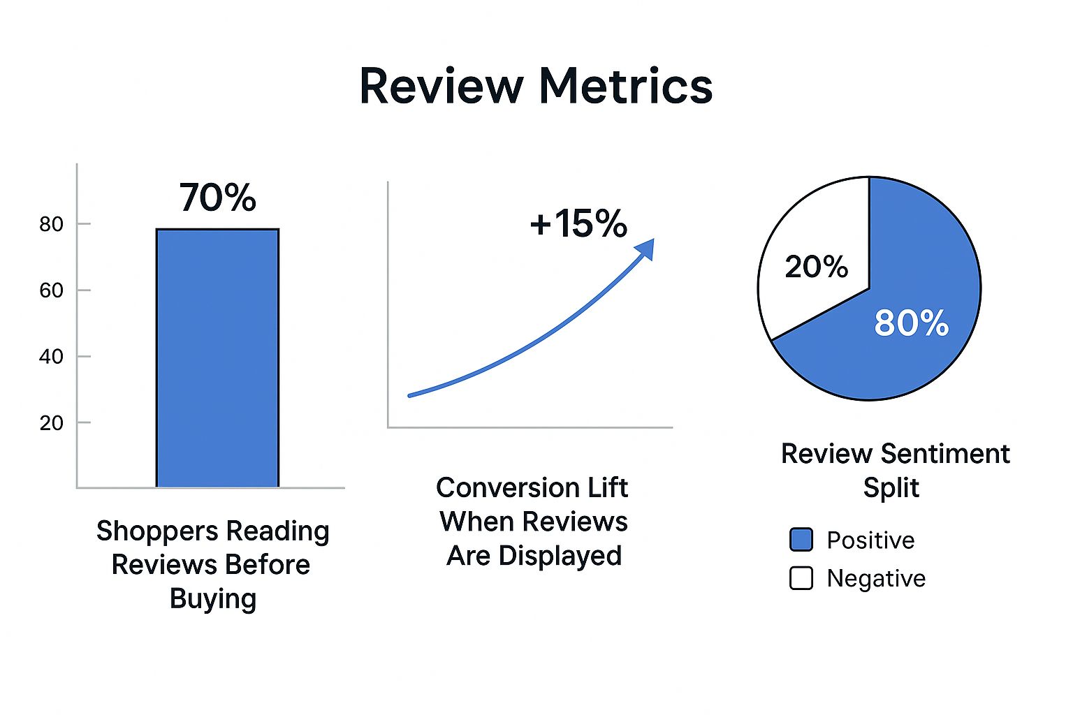
The data doesn't lie. Displaying real reviews builds the confidence someone needs to follow through. Along with reviews, make sure your security badges (like SSL certificates) and trust seals are clearly visible. These small visual cues reinforce that the transaction is secure, giving shoppers that final push of confidence they need to click "Complete Order."
Using Data and Testing for Smarter Growth
The top ecommerce brands I've worked with don't operate on guesswork. They're not just lucky. They run on a simple but powerful cycle: test, learn, and refine. Every lasting improvement comes from an intentional, data-backed decision designed to systematically remove friction from the customer's path to purchase.
This data-first mindset is what separates a store that plateaus from one that achieves sustainable, long-term success. It’s about moving beyond vanity metrics and digging into the numbers that tell you the real story of how people behave on your site. You start asking "why" customers are dropping off and then form educated guesses—hypotheses—that you can actually put to the test.
In today's market, this isn't just a good idea; it's essential. With global online sales projected to soar to $6.86 trillion from over 2.77 billion shoppers, the competition is absolutely fierce. In a market this massive, even tiny tweaks to your conversion rate can translate into huge revenue gains.
Think about it: improving a site's conversion from 2% to 3% isn't just a 1% lift. It's a 50% increase in sales. You can get a better sense of the scale from this deep dive into ecommerce statistics.
Demystifying A/B Testing
This is where A/B testing, or split testing, becomes your best friend. It’s a straightforward method for comparing two versions of a webpage to see which one performs better. You simply show version A to one group of visitors and version B to another. Then, you measure which version leads to more of your desired actions. It’s a direct way to let your customers vote with their clicks.
The secret to great A/B testing is starting with a strong hypothesis. This isn't just a random guess; it's an informed statement you've built from data or a solid observation. A good hypothesis usually follows this structure: "If I change [X], then [Y] will happen, because of [Z]."
For instance, let's say you're digging through your analytics and notice a ton of mobile users are bailing on their carts at the payment step. That observation could lead to a hypothesis like this:
"If we change the primary call-to-action button color from gray to bright orange on the mobile checkout page, then the cart-to-purchase conversion rate will increase, because the orange button will be more visually prominent and create a clearer path to completion."
See how that works? It’s specific, you can measure it, and it's based on a logical reason. That’s a perfect candidate for an A/B test.
What Meaningful Elements Should You Test?
While you could test every tiny detail, you’ll get the best results by focusing on elements that directly influence a user's decision. Your time is valuable, so start with the changes most likely to produce a significant impact.
Here are some high-impact areas I always recommend focusing on first:
- Headlines and Value Propositions: How are you communicating your core benefits? Test a headline focused on "Free Shipping" against one that highlights a "5-Year Warranty" and see which one resonates more.
- Call-to-Action (CTA) Buttons: Play with the text, color, and placement of your CTAs. I’ve seen stores make a surprising amount of money just by changing "Buy Now" to "Add to Basket."
- Product Photography: Does your hero image do the job? Test a lifestyle photo showing your product in action against a clean, crisp shot on a white background.
- Page Layout and Navigation: For a more advanced test, you could try a completely different product page layout. Maybe a single-column design on mobile reduces scrolling and leads to more "add to cart" clicks.
Finding Hidden Opportunities in Your Analytics
Your website analytics platform, whether it's Google Analytics or something else, is a goldmine. It's where you'll find the user behavior patterns that will spark your next great A/B test. The trick is to go deeper than the surface-level reports.
Start by mapping out your conversion funnels. Pinpoint the exact step where the highest percentage of users give up and leave. Is it on the product page? Or maybe when they have to enter their shipping info? That drop-off point is your biggest leak, and fixing it should be your first priority.
Next, start segmenting your audience. Are mobile users converting at a much lower rate than desktop users? Are visitors from that new ad campaign bouncing immediately?
Here’s a real-world scenario: You notice your "Add to Cart Rate" is weirdly low on your best-selling product. You segment the traffic and discover that visitors coming from Instagram have an especially awful rate. This immediately tells you there’s probably a disconnect between your ad and what they see on the product page.
That one insight gives you a clear mission. You can now form a hypothesis and run a targeted test to create a smoother, more consistent experience for that specific audience. This systematic process of analyzing and testing is how you start improving your ecommerce conversion rates for good.
Answering Your Top Questions About Conversion Rates
Once you start digging into conversion optimization, a lot of questions pop up. You've got the core strategies down—from perfecting product pages to smoothing out the checkout flow—but let's tackle some of the most common things store owners ask. Think of this as a quick-reference guide to help you move forward with confidence.
What’s a “Good” Conversion Rate, Anyway?
This is easily the most asked question, and the real answer is... it depends entirely on your industry and product.
Sure, you'll see a global average thrown around—somewhere between 2% and 3%. But that number is pretty much useless without context. A shop selling affordable, impulse-buy cosmetics might see conversion rates of 4% or higher. Meanwhile, a brand selling high-ticket custom furniture could be incredibly profitable at 1.5%. They're completely different ballgames.
So, what should you do? Stop chasing universal benchmarks and start competing with yourself. A "good" conversion rate is one that’s getting better over time. Your main goal should always be to beat your own numbers from last month or last quarter.
The only benchmark that truly matters is your own. If you moved from a 1.8% conversion rate last quarter to 2.1% this quarter, that's a massive win. That’s real progress, and it’s a much better metric for success than some generic industry report.
How Long Until I Actually See Results from This?
The timeline for seeing a payoff from conversion rate optimization (CRO) is all over the map. Some tweaks give you a near-instant boost, while bigger changes need time to marinate and collect enough data to prove they're working.
Here’s a realistic breakdown of what to expect:
- Quick Wins (Days to a Few Weeks): Simple A/B tests on your busiest pages can show results fast. Think about changing the color of your "Add to Cart" button or testing new headline copy. These can often reach statistical significance in just a couple of weeks. And if you find something obviously broken, like a dead link in your checkout? Fixing that delivers an immediate lift.
- Medium-Term Gains (1-3 Months): This is the sweet spot for more involved projects. Redesigning your product page layout or completely streamlining a clunky, multi-step checkout process falls into this category. You'll need to run these tests long enough to gather solid data from different types of visitors.
- Long-Term Impact (3+ Months): The big, foundational stuff takes time. We're talking about building out a complete library of high-quality product photography for your entire catalog or overhauling your site's main navigation. These are long-term investments, and the positive effects will compound over time as customers enjoy a consistently better and more trustworthy shopping experience.
I Need a Win Now. Which Optimizations Are Fastest?
If you're looking for low-hanging fruit, you need to focus on changes that hit the intersection of high traffic and high intent. Small adjustments in these critical spots can produce surprisingly big returns, fast.
For the quickest results, put these three things at the top of your to-do list:
- Seriously Upgrade Your Product Photography: Let's be honest, your product images do most of the selling. Swapping out blurry, single-angle photos for a set of sharp, multi-angle shots can have an immediate impact. You don’t need a fancy studio, either. Our guide on building a DIY product photography setup shows you exactly how to get professional-looking results on a tight budget.
- Add a Guest Checkout Option: Forcing someone to create an account before they can give you money is one of the oldest conversion killers in the book. Adding a big, obvious "Checkout as Guest" button is probably the single easiest way to reduce cart abandonment overnight.
- Make Your Value Proposition Obvious: Don't make people hunt for the reasons to buy from you. Your best perks—like free shipping, hassle-free returns, or a satisfaction guarantee—need to be front and center. Put them in a banner at the top of your site, right next to the "Add to Cart" button, and reinforce them again during checkout.
Ready to stop losing sales to poor-quality images? QuickPixel transforms your basic product photos into professional, high-converting visuals that build trust and drive sales. Ditch the expensive photoshoots and see the difference AI-powered editing can make. Get your studio-quality photos now.
Try QuickPixel Today
Get started with our AI-powered image generation tools