Best Background for Product Photography: Tips & Ideas
Your choice of background for product photography is far more than just a backdrop. It's a powerful sales tool that can either build trust with a customer or distract them completely. A clean, professional background makes your product the hero, while a more creative one can tell a compelling story about your brand and grab someone's attention.
Why Your Background Is a Critical Sales Tool
The background you choose for your product photos sets the entire stage. It’s the very first visual cue that tells a potential buyer if your brand is professional, trustworthy, and worth a closer look. Think about it: a cluttered or poorly chosen backdrop can instantly cheapen an otherwise high-quality product, creating just enough hesitation to kill a sale.
On the other hand, the right background gets rid of all the noise. It forces the customer’s focus directly onto your product’s best features and craftsmanship. This kind of visual clarity is non-negotiable in e-commerce, where people rely only on images to decide what to buy. A well-executed background doesn't just show off a product; it frames it in a way that highlights its value and builds subconscious confidence in your brand.
Building a Cohesive Brand Aesthetic
Consistency is the bedrock of any memorable brand. When you use a consistent background for product photography across your website, social media, and marketing, you create a cohesive and professional look. This visual harmony makes your brand instantly recognizable and helps turn first-time visitors into loyal customers.
Whether you decide on a crisp white background for a minimalist feel or something like textured wood for a rustic vibe, the secret is sticking with it. This consistency ensures every single customer touchpoint reinforces your brand identity, making the entire experience feel seamless.
The background isn’t just empty space; it’s an active element in your photo that communicates mood, quality, and context. It’s the silent salesperson that works 24/7 to frame your product in the best possible light.
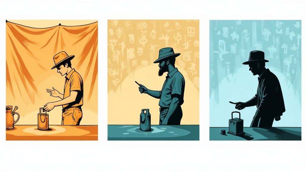
This infographic really breaks down how clean and creative backgrounds influence the way customers see your products.
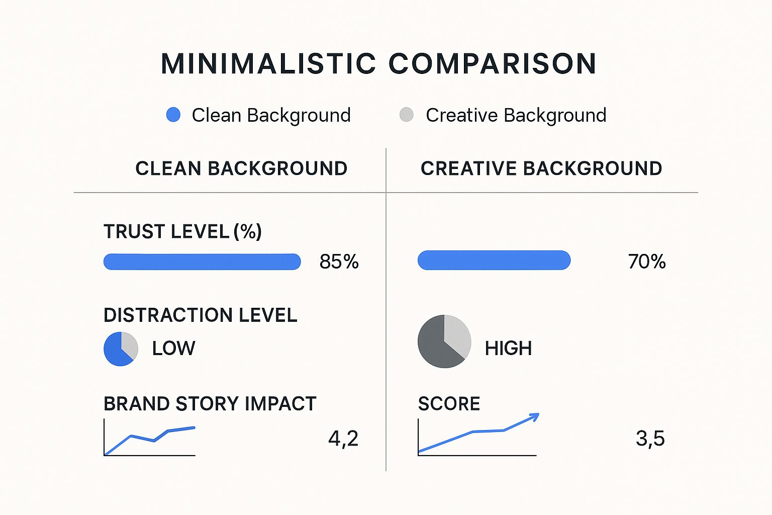
The data speaks for itself. While clean backgrounds are unbeatable for building trust and keeping things focused, creative backdrops are much better at telling a memorable brand story.
The Psychology of Simplicity
There's a reason simple backgrounds work so well, and it's backed by psychology. It’s all about cognitive fluency—the simple idea that our brains prefer things that are easy to understand.
When a customer sees your product against a clean, uncluttered backdrop, their brain processes the visual information faster and with less effort. This ease of processing often leads to a more positive feeling about the product itself. In short, the right background makes the decision to buy feel easier and more intuitive, which can have a direct impact on your conversion rates.
Picking the Right Backdrop for Your Product Photos
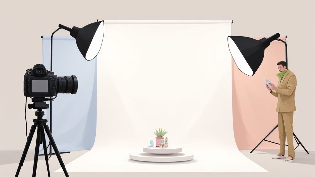
Choosing the right background for product photography is a bit like picking the perfect frame for a masterpiece. It needs to elevate the subject without ever stealing the show. Let's walk through some of the most common and effective options I've used over the years, so you can find the perfect fit for your products and brand.
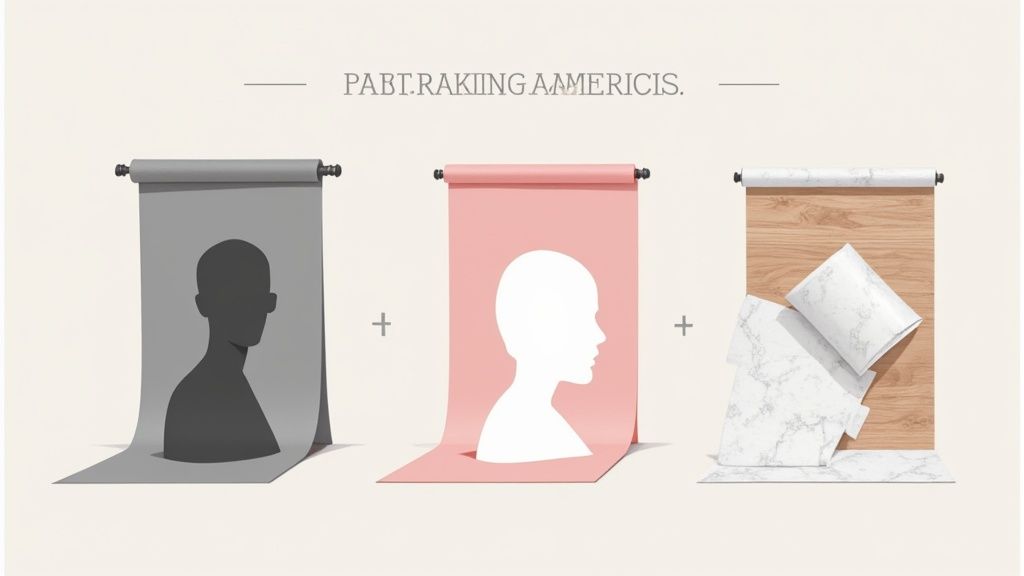
Seamless Paper: The Go-To Studio Standard
There’s a reason seamless paper is a staple in almost every studio. It’s affordable, available in a rainbow of colors, and gives you a perfectly smooth, non-reflective surface that’s a dream to light.
This is your best bet for creating that clean, consistent look, especially for e-commerce sites like Amazon or Shopify. For example, a neutral gray paper works wonders for metallic items like jewelry or electronics, as it cuts down on glare and really makes the product's colors stand out. On the other hand, soft pastels are fantastic for beauty and wellness products, lending them an immediate touch of elegance.
The only real downside is that paper is fragile. It creases and gets dirty easily. But the fix is simple: just snip off the used part and roll down a fresh, clean section.
Vinyl Backdrops: Durable and Ready for Anything
If you need something tougher than paper, vinyl backdrops are a fantastic investment. They’re tear-resistant, incredibly easy to wipe clean, and can be used over and over again. For a busy studio, they pay for themselves in no time.
Vinyl truly shines during messy shoots with liquids, food, or makeup. A makeup smudge that would permanently stain a paper roll can be wiped off a vinyl surface in seconds. Many also come printed with surprisingly realistic textures like wood, marble, or concrete. These are brilliant for adding context without the hassle of heavy props—a faux marble slab can instantly give luxury skincare a high-end vibe.
Pro Tip: Always go for a matte vinyl backdrop. A glossy finish can create a plastic-like sheen and distracting reflections, which can seriously cheapen the look of your final shot.
Making smart choices like these has a real impact. The global product photography market, valued at $0.87 billion** in 2025, is expected to more than double to **$1.78 billion by 2033. And it's no wonder—high-quality images can boost conversion rates by up to 30%. You can dive deeper into these photography marketing statistics to see how visuals directly influence sales.
Fabric Backdrops: For a Touch of Softness and Texture
Sometimes you need a softer touch. Fabrics like muslin, linen, or canvas introduce a lifestyle feel that rigid backgrounds just can't replicate. They’re perfect for brands with a handmade, organic, or natural aesthetic.
Imagine a linen backdrop for artisanal home goods or a soft, flowing muslin for baby products. The subtle texture adds real depth and a tactile quality to the photo, helping customers envision the product in their own homes.
Just be prepared to keep a steamer handy. Fabrics wrinkle, and you’ll want to smooth them out before every shoot to maintain a professional look.
Natural Environments: Weaving a Narrative
Let's be honest, sometimes the best background isn't a "backdrop" at all—it's the real world. Shooting your product in a styled interior or a beautiful outdoor setting can tell a compelling brand story and show the product in its element.
Think about these scenarios:
- Outdoor Gear: A rugged backpack sitting on a mossy rock in a sun-dappled forest.
- Kitchenware: A beautiful ceramic bowl on a rustic wooden dining table, ready for a meal.
- Fashion Accessories: A stylish handbag casually placed on the seat of a chic café.
This approach forges an emotional connection with your audience. It moves beyond a simple product shot and creates an aspirational lifestyle image. While it takes more planning, the result is often incredibly engaging content that’s perfect for social media and major marketing campaigns.
Choosing a background isn't just a technical decision; it's a creative one that shapes how customers perceive your product. To make it easier, here's a quick comparison of the most popular options.
Comparing Popular Product Photography Backgrounds
| Background Type | Best For | Pros | Cons |
|---|---|---|---|
| Seamless Paper | E-commerce, studio shots, clean and minimalist aesthetics | Huge color variety, smooth and non-reflective, affordable | Tears and creases easily, not reusable if soiled |
| Vinyl | Food, cosmetics, messy products, textured looks | Extremely durable, waterproof, easy to clean, reusable | Can have glare if not matte, can look artificial if low quality |
| Fabric (Muslin/Linen) | Lifestyle, home goods, apparel, handmade products | Adds softness and texture, portable and lightweight | Wrinkles easily, can be difficult to light evenly |
| Natural Environment | Storytelling, social media, branding campaigns | Highly authentic and contextual, creates an emotional connection | Requires location scouting, dependent on weather and lighting |
Each material has its place in a photographer's toolkit. Your choice will ultimately depend on the story you want to tell, the product you're shooting, and the overall vibe you want to create.
Selecting a Background That Fits Your Brand
Choosing a background for your product photos isn't just about what looks good; it's a strategic move that speaks volumes about your brand. Think of your backdrop as a natural extension of your brand’s personality. Getting this right creates a cohesive, memorable experience for your customers and is a cornerstone of building a powerful visual identity.
Ultimately, your choice needs to support your overall brand message, which is a crucial part of any set of effective branding strategies. A consistent look across all your photos builds trust and helps your products become instantly recognizable.
Aligning Backdrops with Brand Identity
So, what is your brand's core message? If you’re all about a modern, minimalist vibe, a clean, solid background is your best bet. Think crisp white, light gray, or a subtle brand color to reinforce that sleek, uncluttered feeling. This approach is perfect for tech gadgets, contemporary home goods, and minimalist fashion because it puts 100% of the focus on the product's design.
On the other hand, if your brand is more rustic, organic, or handmade, you'll want to lean into textured backgrounds to tell a richer story. A weathered wood surface, a soft piece of linen, or even a slate tile can add a sense of warmth and authenticity. Imagine a handcrafted leather wallet photographed on a dark, grainy wood backdrop—it immediately communicates craftsmanship and quality before the customer even reads a word.
Let the Product Guide Your Choice
When in doubt, look at the product itself. Its color, material, and finish are your best clues for choosing the right background. A bad pairing can make your product clash with its environment or, worse, completely disappear.
Here are a few common scenarios I run into all the time:
- Dark, Reflective Products: Shooting things like polished jewelry or glossy electronics can be a real headache. A dark background can make them vanish, but a bright white one creates harsh, distracting reflections. My go-to solution is usually a medium gray or a softly textured surface—it tames the reflections and provides just enough contrast.
- Light, Matte Products: An all-white product with a matte finish can easily get lost on a pure white background. To fix this, I'll use a slightly off-white, light gray, or a soft pastel. That subtle difference creates the separation needed for the product's shape and details to really pop.
- Colorful Products: When your product is the star with its vibrant colors, the background needs to play a supporting role. A simple neutral like white, gray, or black is almost always the right call. It ensures the product’s colors are the main event, avoiding the visual chaos a competing colorful background would create.
The goal is harmony, not competition. Your background should make the product look its best without ever stealing the spotlight. It’s a subtle art of balancing color, texture, and brand message in a single frame.
Consider the Platform and Purpose
Finally, always ask yourself: where are these photos going to live? The perfect background for product photography can change dramatically depending on the platform.
For an Amazon or Shopify product listing, a seamless white background is the undisputed industry standard. It's clean, removes all distractions, and often meets strict marketplace requirements.
But your Instagram feed or a lifestyle blog post? That’s where you can get creative and tell a story. A styled scene with a contextual background—like a coffee mug on a kitchen counter—can drive significantly more engagement. If you're looking for more ways to create stunning visuals without breaking the bank, check out our guide to affordable product photography.
Mastering Lighting for Flawless Backgrounds
You can pick the most incredible background for product photography, but if your lighting is off, the whole shot falls flat. Light is what carves out your product's shape, sets the mood, and turns a simple backdrop into a clean, professional-looking canvas.
Here’s a pro tip that changes the game: think of your product and your background as two completely separate subjects. They each need their own lighting. This one shift in thinking is the secret to getting those sought-after, catalog-ready product shots.
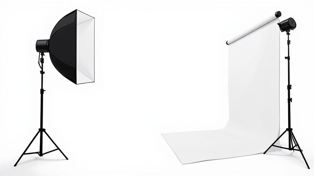
Creating a Pure White Shadowless Background
That crisp, pure white, shadow-free look you see all over e-commerce sites? It's impossible to achieve with a single light. The trick is to light the background and the product independently, which gives you total control.
It really comes down to a simple, two-light setup. Getting this right in-camera will save you hours of tedious editing later.
Here's how I approach it:
- Light the Product First: Forget the background for a minute. Set up your main light (your "key light") and get your product looking absolutely perfect.
- Bring in a Background Light: Now, place a second light behind your product, pointing it straight at the backdrop. The only job of this light is to illuminate the background.
- Overexpose the Background (On Purpose!): Crank up the power on that background light until it’s about one to two stops brighter than your key light. This intentional "blowout" turns the background pure white, completely erasing any pesky shadows your product might be casting.
This technique is a cornerstone of any good DIY product photography setup and is often a requirement for selling on major online marketplaces.
Achieving Subtle Gradients and Mood
Of course, not every photo needs a stark white background. Sometimes a subtle gradient adds a touch of sophistication and depth. You can pull this off with just one light aimed at the backdrop.
By positioning the light off to one side or aiming it from the top or bottom, you create a gentle falloff from light to dark. This gives the background dimension without distracting from the main event—your product.
The key to a good gradient is subtlety. You're aiming for a sense of dimension that supports the product, not a dramatic effect that steals the show. A soft, gradual transition always looks more professional than a harsh, obvious one.
Lighting Textured Backgrounds
When you’re working with tactile surfaces like wood or fabric, your lighting strategy flips. Instead of trying to eliminate shadows, you want to use them to your advantage to bring out all that great texture.
- For Wood: I like to use a harder light source positioned at a low angle to the side. This is called "raking light," and it skims across the surface, casting tiny shadows that make the wood grain pop.
- For Fabric: A softer, more diffused light usually works best here. Place it off to the side to gently reveal the weave of the fabric without creating harsh, distracting patterns.
Mastering light is about so much more than just the backdrop; it's what creates truly stunning product photos. For a deeper dive into the technical side of things, check out this guide on a professional product photography lighting setup.
Common Background Mistakes to Avoid
One of the best ways to get better at product photography is to see where others have gone wrong. A few common slip-ups can easily derail a photoshoot, even if you have the best intentions. By dodging these pitfalls from the start, you'll save yourself a ton of time and produce images that truly let your products shine.
A classic mistake I see all the time is picking a background that's just too busy. Whether it's a loud pattern, an overly bright color, or a distracting texture, the wrong backdrop can completely swallow your product. Remember, the background is a supporting actor; the product is the star.
Another major issue is a lack of consistency. When every product on your website has a different background, lighting setup, and angle, it just looks messy. That kind of visual chaos can make your brand feel unprofessional and even erode trust with potential customers.
Overlooking the Small Details
Wrinkles, dust, and scuff marks are the silent killers of a great product photo. A crumpled piece of fabric or a creased sheet of paper instantly makes even a high-end product look cheap. It only takes a few minutes to steam a backdrop or wipe down a surface, but it makes a world of difference.
Reflections can be just as problematic. Unwanted glare on a glossy product or a shiny background can hide key features and give the photo a low-quality feel.
The best product photography backgrounds are the ones you don't even notice. They should blend in so seamlessly that the customer's eye goes right to the product without any distraction.
The Importance of Color Harmony
You don't need to be an art historian to know that some colors just don't work together. Choosing a background color that clashes with your product is one of the fastest ways to create an image that's just plain hard to look at.
- Complementary Colors: These are colors on opposite sides of the color wheel. They create a powerful, high-contrast look but can easily become jarring if you're not careful.
- Analogous Colors: These sit next to each other on the color wheel. This approach creates a much more harmonious, soothing vibe that’s often a safer bet for e-commerce.
The global photography services market was valued at around $55.6 billion** in 2023 and is expected to reach **$81.83 billion by 2032. This incredible growth shows just how much businesses are investing in high-quality visuals.
Getting the background right in-camera is ideal, but many of these issues can be fixed with smart post-production work. For a deeper dive, check out our guide to photo editing for e-commerce.
Your Top Questions, Answered
Even the most seasoned photographers hit a snag now and then. When you're in the middle of a shoot, having quick answers to common questions about your background for product photography can be a lifesaver. Let's dig into a few of the questions I hear most often.
What’s the Absolute Best Background Color?
This is the million-dollar question, isn't it? While a crisp, pure white background is the go-to for marketplaces like Amazon, calling it the "best" isn't always accurate. The right color truly hinges on your brand's vibe and the product you’re shooting.
I’m a big fan of using a light or medium gray. It’s a fantastic, sophisticated alternative to stark white and works wonders for tricky items, especially anything reflective or very pale. It adds just enough depth to make the product stand out without stealing the show.
And if you’re shooting for your own website or social media? Pull a color straight from your brand's palette. This is a surefire way to build a strong, cohesive visual identity. Just remember the golden rule: the background should always complement the product, never overpower it. Your product is the star.
How Can I Get a Pro Background Without Breaking the Bank?
You really don't need to spend a fortune to get a high-end look. Seriously. One of my favorite budget-friendly tricks is to grab a big sheet of white poster board from a craft store. For smaller items, you can just prop it against a wall and let it curve down onto your surface. Boom—instant seamless background.
Also, don't overlook the textures that are probably already around you. A nice wooden table, a single slate tile from the hardware store, or even a patch of smooth concrete can make for incredible, high-character backdrops that cost you next to nothing.
The best backgrounds are often the simplest ones. Your goal is to create a clean stage that lets your product shine, and you can absolutely achieve that with just a little creativity and minimal cash.
How Do I Get That Pure White Background Straight from the Camera?
Getting a perfect white background in-camera is the holy grail for e-commerce photographers—it saves so much time in post-production. The secret? You have to light your background and your product separately.
Here’s how it’s done: you'll need at least two lights.
- Use your main light (your key light) to get the product looking perfect.
- Then, place a second light behind your product, pointing only at the background.
You need to crank up the power on that background light until it completely overexposes the white surface. You're aiming to "blow it out" to a pure digital white (RGB 255, 255, 255). This technique completely vaporizes any shadows the product might cast, giving you that slick, ready-for-the-catalog look right out of the camera.
Tired of wrestling with backdrops and lighting? QuickPixel uses AI to transform your simple product photos into studio-quality images with flawless backgrounds. Stop spending hours on setup and editing—get professional results fast. Learn more about how QuickPixel can upgrade your product photography.
Try QuickPixel Today
Get started with our AI-powered image generation tools