what is white balance in photography? A quick color guide
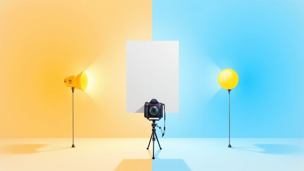
At its core, white balance is how your camera makes sure things that are white in real life actually look white in your photos. It's the key to getting rid of those weird color tints—like an unnatural orange glow or a chilly blue hue—that can completely throw off an image.
Essentially, white balance is the process of neutralizing the color of the light source, so your photos reflect what you actually saw.
Your Guide to Perfect Color Accuracy
Have you ever taken a photo inside, only to find everyone looks like they have an orange spray tan? Or maybe you snapped a shot on a cloudy day, and it came out with a cool, almost sad, blue feeling? That's a classic white balance issue. Getting a handle on what white balance is and how to control it is one of the biggest steps you can take toward truly professional-looking images.

Think of it this way: your brain is a supercomputer. It knows a white t-shirt is white whether you're standing under the warm, yellowish light of a lamp or the cool, blueish light of a gray sky. It automatically compensates.
Your camera, on the other hand, isn't that smart. It just sees the light it's given. If the light is orange, the camera captures orange. That's why you need to give it a little help by setting the white balance, telling it, "Hey, this is what 'white' looks like in this light."
Why Correct White Balance Matters
Nailing your white balance in the camera isn't just a minor technical detail; it's a game-changer. It’s what separates a quick snapshot from a polished, professional photograph. Once you get this right, you'll see a massive improvement in your work.
Here’s why it’s so critical:
- True-to-Life Colors: The main goal is simple: capture colors as they truly are. This is absolutely non-negotiable for something like product photography, where a customer's decision to buy hinges on seeing the product's actual color.
- Professional-Looking Skin Tones: Nothing screams "amateur photo" faster than bad skin tones. The wrong white balance can make people look sickly green, unnaturally orange, or even ghostly blue. Getting it right ensures everyone looks healthy and natural.
- Reduced Editing Time: By setting the white balance correctly from the start, you save yourself a ton of headaches later. Instead of battling color casts in every single photo during editing, you can spend that time on more creative adjustments.
- Creative Control: Once you know the rules, you can break them. You can intentionally create a warm, cozy vibe for a photo or a cool, moody atmosphere just by tweaking the white balance. It becomes a powerful artistic tool.
In essence, white balance is the foundation of good color. It is the invisible force that ensures the colors in your photographs are believable and impactful, creating a direct line of trust between your image and the viewer.
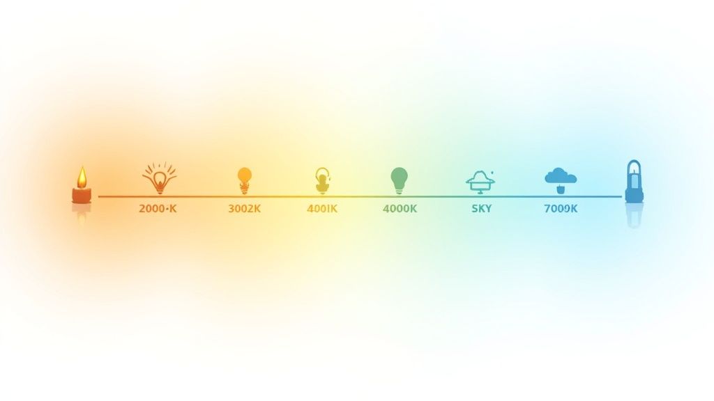
To help you visualize how different light sources affect your photos, here’s a quick breakdown of their typical color temperatures and the tints they produce if left uncorrected.
Common Light Sources and Their Color Effects
| Light Source | Typical Color Temperature (Kelvin) | Resulting Color Cast (Without Correction) |
|---|---|---|
| Candlelight | 1000–2000K | Very strong orange/yellow |
| Tungsten/Incandescent Bulb | 2500–3500K | Warm yellow/orange |
| Direct Sunlight (Golden Hour) | 3000–4000K | Warm golden |
| Fluorescent Light | 4000–5000K | Cool green/blue |
| Daylight/Flash | 5000–6500K | Neutral/Slightly cool |
| Cloudy Sky/Shade | 6500–8000K | Cool blue |
| Heavy Overcast/Deep Shade | 8000–10000K | Strong blue |
Understanding this chart helps you anticipate what your camera will "see" and makes it easier to select the right white balance setting for any situation.
As you start your journey toward perfect color, having the right gear is a fantastic first step. To get properly kitted out, take a look at an essential photography starter kit for beginners. Mastering this fundamental concept will make every other part of your photography, from shooting to editing, so much more successful.
The Science of Color Temperature Explained
To really get a handle on white balance, you first need to wrap your head around a concept called color temperature. Don't let the name fool you—it has absolutely nothing to do with how hot or cold a light feels. Instead, it’s a way to describe the actual color of a light source. Think of it as the foundation for everything we do with white balance.
We measure this color in a unit called Kelvin (K). The Kelvin scale is essentially a spectrum of light color. At the very bottom, you have warm, fiery colors like the orange of a candle flame. As you climb higher up the scale, the light gets cooler, moving through a neutral white and eventually into a distinct blue.
This isn't some abstract scientific theory; you see it in action every single day. The warm, inviting glow of a candle or an old-school incandescent light bulb gives off a very orange-heavy light, which sits way down on the scale at around 1800K to 3000K.
From Warm Sunrise to Cool Shade
As the sun makes its journey across the sky, its color temperature is constantly changing. This is precisely why the same landscape can look wildly different at 7 a.m. versus high noon, and it's a huge part of why photographers need to actively manage their white balance.
Let's break down some real-world examples:
- Golden Hour (Sunrise/Sunset): During these magical moments, the sun hangs low, and its light has to travel through a lot more of the Earth's atmosphere to reach you. This journey scatters the cooler blue light, leaving behind those beautiful, warm, golden tones we all love. This light typically falls in the 3000K to 4000K range.
- Midday Sun: When the sun is directly overhead, its light is at its most neutral and direct. This is often what we think of as standard "daylight" and measures around 5500K, giving off a clean, balanced light.
- Overcast Sky or Shade: On a cloudy day, or when you're shooting in the shade, the direct sun is blocked. Your main light source becomes the big, blue sky itself. This results in a much cooler, bluer light that can easily push past 7000K.
The entire history of photography has been a quest to understand and compensate for these shifts. From the very beginning, photographers have grappled with the Kelvin scale, even if they didn't call it that. Light sources vary dramatically: candlelight hovers around 1800K, old tungsten bulbs are in the 2800K to 3200K range, midday sun is about 5500K, and an overcast sky can soar to 7000K. White balance is simply the tool we use to neutralize these wild differences. For more on how this all came to be, the Science and Media Museum's website offers some fantastic insights.
Connecting Kelvin to Your Camera Settings
Okay, so how does all this science translate to the buttons and dials on your camera? It's simpler than it sounds. Every white balance setting, from "Auto" to "Tungsten," is designed to counteract a specific color temperature. The goal is to add the opposite color to whatever color cast is present in your scene.
This is the key: To fix a warm, orange light, your camera adds blue. To fix a cool, blue light, your camera adds orange.
Here’s a practical look at how that works:
- Warm Light Source (e.g., 3000K Tungsten Bulb): You're indoors under an old lamp. If you tell your camera you're shooting in "Tungsten" mode, it knows that light is very orange. To make a white object look white, it internally shifts its colors toward the blue end of the spectrum to cancel out the orange.
- Cool Light Source (e.g., 7000K Cloudy Sky): Now you’re outside on a gray day. If you select the "Cloudy" preset, your camera knows the ambient light is blue. To balance the shot, it will automatically add warmth—yellows and oranges—to make the scene feel natural and neutral.
Once you understand the Kelvin scale, you stop just guessing with presets and start making deliberate, creative choices. Suddenly, white balance isn't a technical chore; it's a powerful tool for controlling the mood and accuracy of your photos. You can aim for perfect, true-to-life color, or you can intentionally lean into a warmer or cooler look to create a specific feeling. The control is all yours.
How Your Camera Handles White Balance
Now that we’ve covered the science of color temperature, let's pop the hood and look at your camera's toolbox. Every digital camera has a powerful set of white balance settings built right in, designed to help you nail accurate colors in just about any light you can imagine.
Figuring out what each setting does—and more importantly, when to use it—is the key to taking full control of your images. These settings range from "set it and forget it" automatic modes to granular manual controls that give you the final say on color. Let's start with the basics and work our way up.
The Simplicity of Auto White Balance
The default setting on pretty much every camera out of the box is Auto White Balance (AWB). When AWB is on, your camera’s brain analyzes the entire scene and makes its best guess at the right white balance to make things look neutral.
In a lot of cases, especially with good, even light, modern AWB systems are shockingly good. They can deliver clean, neutral colors with zero effort on your part. In fact, camera technology has improved so much that in well-lit scenarios, auto modes get it right over 90% of the time.
But AWB isn't perfect. It can get thrown for a loop in a few common situations, leaving you with wonky colors.
- Scenes with One Overpowering Color: Imagine you’re shooting a portrait against a massive, bright green wall. The camera might see all that green and think it’s a color cast it needs to "fix." In its attempt to correct the green, it will add its opposite color, magenta, which can make your subject's skin tone look completely unnatural.
- Mixed Lighting: AWB really struggles when you have multiple light sources with different color temperatures. Think of a room lit by warm tungsten lamps near a window pouring in cool, blue daylight. The camera has to pick one to balance for, which almost guarantees that part of your image will have a noticeable color cast.
Using White Balance Presets
For those times when AWB is likely to fail, or when you just want more predictable results, your camera gives you a handful of presets. Each preset is specifically tuned to counteract the color cast from a common type of light.
Think of presets as giving your camera a direct command instead of asking it to guess. You’re telling it, "Hey, we're shooting under tungsten lights," so it knows to add blue to cancel out that orange glow.
Here are the presets you’ll find on most cameras and when to reach for them:
- Daylight (or Sunny): This is your go-to for bright, midday sun, calibrated for around 5500K. It gives you a clean, neutral balance on a clear day.
- Cloudy: Overcast days produce much cooler, bluer light. The cloudy preset warms things up by adding yellow and orange tones to bring your image back to a natural look.
- Shade: Light in open shade is even cooler and bluer than on a cloudy day because the main light source is the big blue sky above. This setting adds even more warmth to compensate.
- Tungsten (or Incandescent): This one is for shooting indoors under those old-school, yellowish-orange light bulbs. It applies a strong blue correction to neutralize that heavy warm glow.
- Fluorescent: Fluorescent lights are notorious for their weird green or magenta tints. This preset is designed to fight that, though you might see a few different fluorescent options on your camera for different types of bulbs.
Advanced White Balance Controls for Total Precision
When the presets just aren't cutting it, your camera offers manual controls that put you in complete command. These are the tools the pros rely on for critical color accuracy, especially in product photography, studio work, or any situation where consistency is non-negotiable.
Manual Kelvin (K) Setting
This mode lets you dial in the exact Kelvin temperature yourself. Instead of just picking the "Cloudy" preset, you can manually set the white balance to 6500K, 7000K, or whatever number perfectly neutralizes the light you’re in. It offers incredible precision and is perfect for photographers who have a good feel for color temperature and want to fine-tune their look on the fly.
Custom White Balance (CWB)
This is, without a doubt, the most accurate way to get a perfect white balance. With CWB, you take a quick photo of something neutral—like a white sheet of paper or, for best results, a professional gray card—under the exact same light as your subject.
You then tell your camera to use that photo as its new reference for "neutral." By doing this, you're literally showing your camera what white looks like in that specific light, allowing it to create a flawless, custom-tailored white balance setting for your scene.
A Step-by-Step Guide to Mastering Manual White Balance
Ready to take the reins? Moving past your camera's automatic modes and presets is the single best thing you can do for your color accuracy. Setting a custom white balance sounds a lot more intimidating than it actually is, but it’s a simple process that guarantees your colors are spot-on, especially when the lighting gets tricky.
You’re essentially putting yourself in the driver's seat.
There are really two main ways to set your white balance manually. You can either take a custom reading from a neutral-colored target or dial in a specific Kelvin temperature yourself. Both are fantastic tools for getting consistent, professional-looking color straight out of the camera.
This infographic breaks down the typical workflow, from the ease of "Auto" to the pinpoint precision of manual settings.
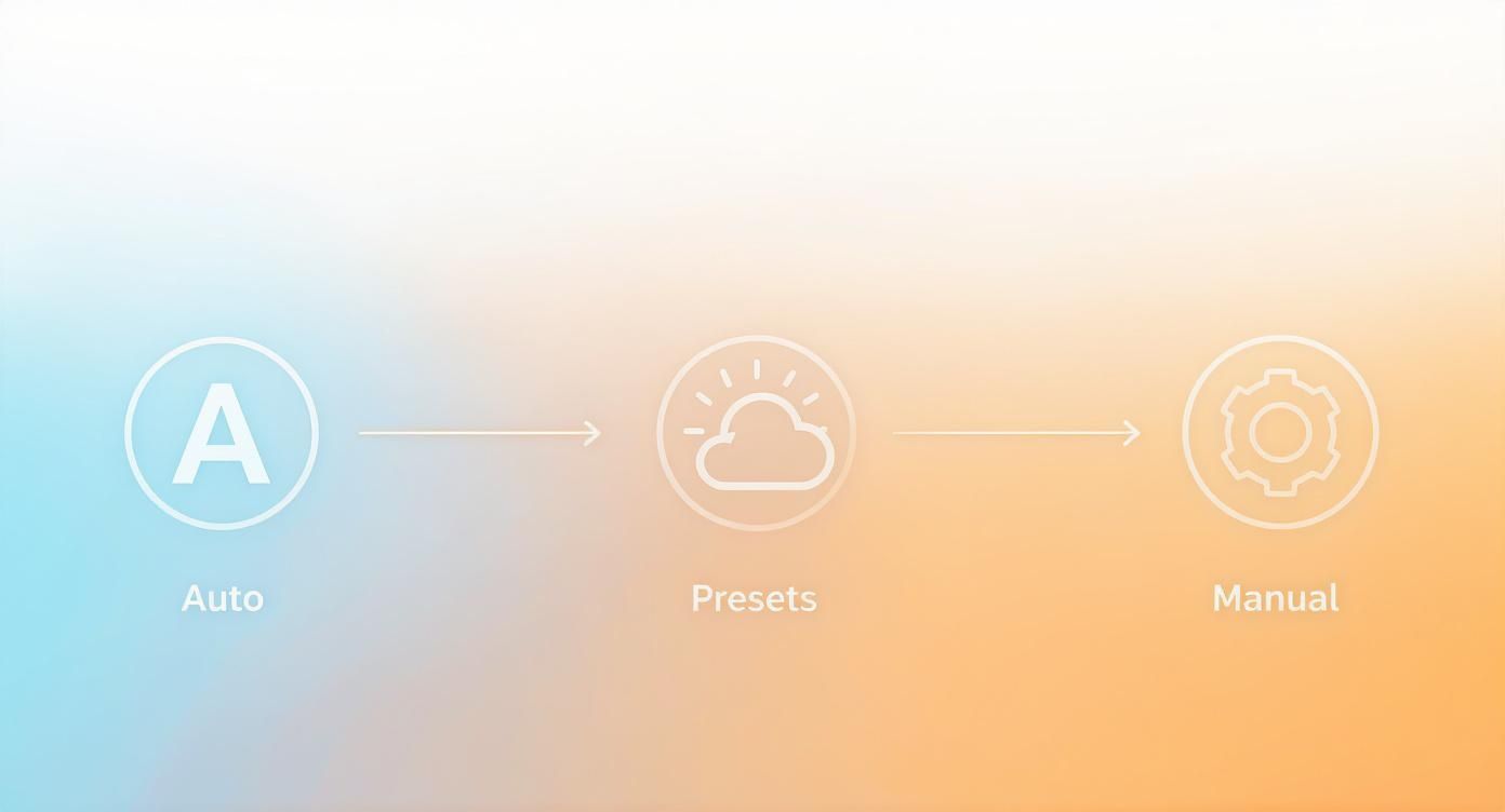
As you can see, each step up the ladder gives you more and more control, letting you perfectly match the color balance to what your scene actually needs.
Setting Custom White Balance with a Grey Card
Using a grey card (or another certified neutral target) is the gold standard for getting perfect white balance. You’re literally showing your camera what a true, neutral grey looks like in your current light, which allows it to create a custom profile that completely eliminates any guesswork.
Now, you could use a simple white piece of paper in a pinch, but a professional grey card is way more reliable. They are designed to be spectrally neutral, which is a fancy way of saying they reflect all colors of light equally. Paper, on the other hand, often has optical brighteners that can fool your camera into seeing a slight blue cast.
Here’s a universal, step-by-step guide that works for most modern cameras:
- Place Your Target: Put your grey card in the exact same light that's hitting your subject. If you're shooting a portrait, have your model hold it near their face. For a product shot, just place it right next to the item.
- Fill the Frame: Flip your lens to manual focus so it doesn't try to hunt for focus. Then, either zoom in or move closer until the grey card fills a big chunk of your screen.
- Take the Reference Shot: Check your exposure, make sure it's correct, and snap a picture of the grey card. This photo is what your camera will use as its reference for "neutral."
- Find the Custom WB Setting: Dive into your camera's menu, go to the white balance settings, and look for an option called "Custom White Balance" or "PRE." The name changes a bit depending on the brand (Canon, Nikon, Sony, etc.), but the idea is the same.
- Set the Reference: Select the option to set your custom white balance and then choose the picture of the grey card you just took. Your camera will analyze it and build a new, perfectly calibrated white balance profile.
- Switch and Shoot: Last step! Change your camera's active white balance setting over to the new Custom profile you just made. Now, every single photo you take in that light will have perfect color. Just remember to redo this process if you change locations or if the lighting shifts.
Dialing in a Manual Kelvin Temperature
The other powerful manual method is to set the Kelvin (K) temperature directly in your camera. This is an awesome approach for studio work where your lighting is consistent, or for photographers who have spent enough time behind the lens to develop a good eye for color temperature. It lets you make quick, precise tweaks without needing to take a reference shot.
By manually setting the Kelvin value, you’re telling your camera the exact color temperature of your light source. This lets it apply the perfect counter-balance. For example, to neutralize a warm 3200K tungsten light, you’d just set your camera’s Kelvin value to 3200K.
This method really shines in a controlled environment. If you're putting together a home studio, getting a handle on this is essential. For more tips on creating a space with consistent lighting, check out our guide to a DIY product photography setup you can build on a budget. Mastering your Kelvin settings in a controlled setup is the key to ensuring your product colors are always true to life.
The best way to do this is with your camera's live view. As you adjust the Kelvin number up or down, you'll see the color shift happen in real-time on your screen. This lets you dial in the look until it's just right, giving you a mix of technical precision and creative freedom—the hallmark of a pro.
Why White Balance Is a Game-Changer for Product Photography
When you're selling online, your product photos aren't just pictures; they're a promise to your customer. Getting color wrong, even by a little, can break that promise and send your return rates through the roof. This is where mastering white balance stops being a technical chore and becomes a vital business skill.
Think about it: until the box arrives, your photo is the product. If a customer orders a "sky blue" shirt that shows up looking more like a washed-out teal, it's more than just a minor mix-up. It feels like a bait-and-switch. Nine times out of ten, incorrect white balance is the silent culprit behind these color disasters.
A subtle orange or blue tint—what we call a color cast—can completely change a product’s appearance. It can make a clean white background look like a dingy, yellowed sheet of paper or turn a fire-engine red dress into something dull and lifeless. This doesn't just look bad; it makes your entire brand feel less professional.
Color Accuracy Builds Customer Trust
Nailing true-to-life color is about more than just pretty pictures. It's about setting and meeting customer expectations. Color is a huge factor in a buyer's decision, so when the product that arrives doesn't match the photo that sold them on it, the disappointment is immediate.
Here's a number that should get your attention: a staggering 22% of all online returns happen because the item looks different in person than it did online. A huge chunk of that is due to bad color representation. Fixing your white balance is one of the single best ways to bring that number down.
Consistent, accurate color across your entire product line isn't a "nice-to-have." It’s a cornerstone of a smart e-commerce strategy. It builds confidence, slashes the costs associated with processing returns, and gives customers a reason to come back and buy again.
How to Get Perfect Product Color, Every Time
In the controlled world of product photography, leaving your camera on Auto White Balance is basically crossing your fingers and hoping for the best. A studio environment demands precision and consistency from one shot to the next.
Here are the tried-and-true techniques the pros rely on:
- Lock Down Your Lighting: The first step to consistent color is consistent light. Whether you're using strobes or continuous LEDs, using the same light source and setup for every photo removes a massive variable. To dig deeper, check out our complete guide to professional product photography.
- Set a Custom White Balance: This is the non-negotiable part. Before you start shooting, use a simple grey card to set a custom white balance. This gives your camera a perfect, neutral reference point, guaranteeing that whites are pure white and product colors are spot-on.
- Always Shoot in RAW: JPEGs might save space, but they bake the white balance settings right into the file, making it a nightmare to fix later. Shooting in RAW format captures all the raw, unprocessed data from your camera's sensor. This gives you incredible flexibility to tweak the white balance during editing without destroying the image quality.
Ultimately, selling products effectively online means showing them as they truly are. Understanding how to control white balance helps you achieve stunning product photos for your business that build trust and reflect reality. It’s a foundational skill that leads to images that don't just attract customers, but keep them happy long after they click "buy."
Fixing White Balance After the Fact
Let’s be honest—even with the best intentions, you won't always nail the white balance in-camera. Maybe you were in a hurry, or the lighting was a chaotic mix of different sources. That’s perfectly fine. Post-production is your secret weapon, the place where you can take a good shot and make it truly perfect.
The single most important decision you can make to give yourself this power is to shoot in RAW format. Think of a RAW file as your digital negative. It holds all the pure, unprocessed data straight from your camera's sensor, which means you have complete freedom to adjust the white balance later without destroying the image quality.
JPEGs, on the other hand, have the white balance "baked in." Try to make a major color shift on a JPEG, and you’ll quickly see the image fall apart, leading to ugly banding and lost details. RAW is your safety net, plain and simple.
Your Go-To Editing Tools
Most photo editing software, like Adobe Lightroom or Capture One, gives you a simple but incredibly powerful set of tools for this. You really only need to get comfortable with three key controls to fix just about any color problem you encounter.
- The Eyedropper Tool: This is your express lane to a neutral image. Just grab the eyedropper, click on something in your photo that should be neutral grey or white, and bam—the software instantly analyzes it and shifts the entire image's color to match.
- The Temperature Slider: This slider moves along a blue-to-yellow axis, giving you direct control over the Kelvin scale. Is your photo too cool and blue? Slide it towards yellow to warm it up. Too warm and orange? Slide it back towards blue to cool it down. It's that intuitive.
- The Tint Slider: This one works on the green-to-magenta axis. It's an absolute lifesaver for correcting those weird green or purplish casts you often get from fluorescent lights or some cheap LEDs.
With these tools in your back pocket, you can rescue just about any photo and guarantee your product colors are spot-on. To see how these simple adjustments fit into the bigger picture of editing, check out our full guide on how to edit product photos.
White Balance as a Creative Choice
Once you’ve mastered how to get a technically perfect, neutral white balance, you can start to have some real fun and break the rules intentionally. White balance isn’t just for fixing mistakes; it's a powerful creative tool for injecting a specific mood or feeling into your photos.
The ability to manipulate white balance is the ability to control emotion. A slight shift toward warm tones can evoke feelings of joy, nostalgia, and comfort, while a push toward cooler tones can create a sense of calm, melancholy, or modernity.
This is a trick used by professional photographers and filmmakers all the time. Think about a romantic sunset scene in a movie—it’s almost always warmed up even more in post-production to really sell that golden-hour magic. On the flip side, a sci-fi thriller might get a cool, blueish tint to create a sterile, high-tech atmosphere.
This creative quest for color control has been driving photography forward for decades. White balance became a massive deal with the advent of color photography, as photographers grappled with the different color casts produced by various light sources. The introduction of Kodachrome film in 1935 was a huge milestone, finally giving photographers a reliable way to capture color and highlighting the need for better white balance techniques.
Putting Creative Control into Practice
Applying these creative tweaks is straightforward. Once you have a good neutral starting point, you can consciously use the Temperature and Tint sliders to push the overall color in a new direction.
- For a warm, inviting feel: Gently nudge the Temperature slider to the right, adding a little yellow or orange. This works wonders for food photography, lifestyle shots, and portraits.
- For a cool, dramatic mood: Slide the Temperature to the left to introduce subtle blues. This is perfect for dramatic landscapes, modern architecture, and moody portraits.
True mastery of white balance means knowing how to get it right and knowing when to get it "wrong" on purpose. It’s the skill that closes the gap between being a technician and an artist, giving you total control over the story your image tells.
Try QuickPixel Today
Get started with our AI-powered image generation tools