Mastering Ecommerce Image Editing
When you sell products online, your photos aren't just pictures—they're your entire sales pitch. Ecommerce image editing is the craft of taking a good product photo and making it great, ensuring it's professional, consistent, and enticing enough to convince a customer to click "buy." It covers everything from removing distracting backgrounds to correcting colors and adding realistic shadows, all to make your products look their absolute best.
Why Better Product Images Drive More Sales
Think about it: in a physical store, customers can pick up an item, feel its texture, and see its true color in the light. Online, your product photos have to do all of that work. They're the primary way you communicate quality and value, which makes professional ecommerce image editing one of the most powerful tools in your growth strategy.
When a potential buyer lands on your product page, they make a snap judgment based almost entirely on what they see. If the photos are poorly lit, have cluttered backgrounds, or show inconsistent colors, it sends a red flag. It might be subconscious, but it plants a seed of doubt about the brand's attention to detail, often stopping a sale before it even starts.
Building Instant Credibility and Confidence
On the flip side, polished and consistent product visuals signal professionalism. They tell the customer you're a serious, reliable brand, which builds the confidence they need to make a purchase. This isn't just about a single product; a clean, uniform look across your entire store creates a cohesive brand identity that feels established and trustworthy.
This direct link between image quality and sales is why the market for editing tools is exploding. Valued at around USD 1.15 billion in 2024, the global photo editing software market is expected to jump to USD 1.82 billion by 2034. That growth is fueled by ecommerce sellers who've learned that in a crowded market, high-quality images are no longer optional. You can find more data on this trend and the photo editing market on market.us.
Reducing Friction and Lowering Returns
Great image editing also makes the buying process smoother. When you accurately show a product's true color and fine details, you're answering a customer's questions before they even think to ask them. This clarity removes hesitation and friction, making it that much easier for a shopper to hit the "add to cart" button.
A huge, often overlooked, benefit of getting your images right is a lower return rate. When the product that shows up at their door is exactly what they saw online, customer satisfaction goes way up, and you spend far less time and money dealing with costly returns.
Ultimately, investing in how you present your products is one of the most direct ways to boost your bottom line. When you show your items in their best possible light, you don't just attract new buyers— you build a loyal customer base that trusts your brand. For more strategies on this, check out our guide on how to increase product sales.
Building a Flawless Foundation for Your Images
Every great product photo you see online starts with the same non-negotiable first steps. Before you even think about creative edits like shadows or color grading, you have to nail the basics. These foundational tasks in ecommerce image editing are what separate a polished, professional store from one that looks thrown together.
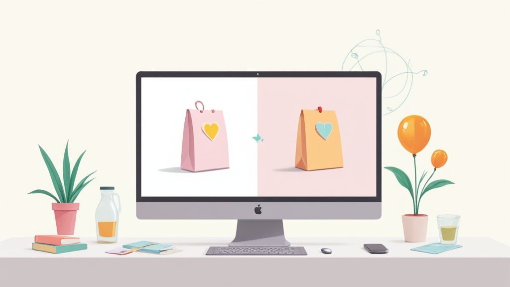
The very first thing on the list? Get that background out of there. A clean, consistent background forces the customer's eye right where you want it: on your product. While one-click AI tools are getting better, they still struggle with tricky edges—think fuzzy sweaters, flyaway hair, or intricate jewelry. A choppy, pixelated cutout is a dead giveaway of an amateur job and can instantly kill a customer's trust.
Mastering Consistency with Cropping and Sizing
With a clean cutout, your next job is to make everything look uniform. This is where consistent cropping and sizing come into play. Every marketplace and social media platform, from Amazon and Shopify to Instagram, has its own ideal image specs.
Sticking to a standard like a square 1:1 aspect ratio is a safe bet that works almost everywhere. When all your main product shots are framed the same way, your category pages look incredibly clean and organized, making it so much easier for customers to browse.
To give you a clearer picture, this infographic breaks down how these foundational edits build on each other to create a trustworthy shopping experience that leads to more sales.
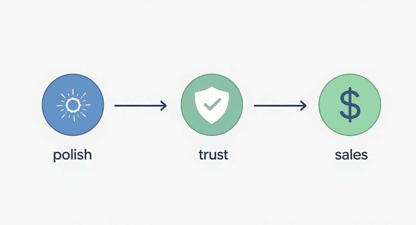
As you can see, it's a logical progression. Each small technical fix directly boosts how customers perceive your brand, which ultimately impacts your bottom line.
To truly understand why these basic edits are so crucial, let's break down the core tasks that not only make your images look good but also ensure they meet the technical requirements of major online marketplaces.
Core Editing Tasks for Platform Compliance and Appeal
| Editing Technique | Why It's Critical | Direct Impact on Your Store |
|---|---|---|
| Background Removal | Eliminates distractions and meets marketplace rules (e.g., Amazon's pure white background requirement). | Creates a clean, professional look that puts 100% of the focus on the product. |
| Consistent Cropping/Sizing | Ensures a uniform, grid-like appearance on category pages and prevents awkward image stretching. | Enhances site navigability and provides a polished, high-end feel. |
| Product Alignment | Centers the product consistently within the frame for a predictable and organized visual flow. | Makes comparison shopping easier for customers and strengthens brand professionalism. |
These aren't just "nice-to-haves"; they are fundamental steps for creating a high-converting ecommerce store. A messy, inconsistent catalog is confusing and signals a lack of attention to detail, which shoppers will absolutely notice.
The Tools for a Professional Cutout
Getting that perfect, crisp edge often requires more than just an algorithm. I've found that for the best results, you really can't beat the control of manual tools.
- The Pen Tool: This is the workhorse in software like Adobe Photoshop. It lets you draw a precise vector path around your product, giving you complete control for razor-sharp edges.
- Refine Edge Brushes: When you're dealing with soft textures like fur, hair, or mohair, these brushes are a lifesaver. They help create a soft, natural transition instead of a hard, artificial line.
- Layer Masking: This is a game-changer. Instead of permanently deleting the background, masking hides it. This means your edits are non-destructive, so you can always go back and tweak the cutout without starting from scratch.
Key Takeaway: The whole point of this foundational stage is to create a clean, consistent canvas. When every product is presented the same way, you remove all distractions, allowing customers to focus entirely on the quality of your items.
Of course, none of this matters if you start with a bad photo. The better your initial shot, the less work you have to do in post-production. If you're handling photography yourself, it’s worth learning how to put together a simple but effective DIY product photography setup. It will save you hours of editing headaches down the line.
Achieving True-to-Life Color and Detail
Once you have a clean slate to work from, the next phase of ecommerce image editing is where the magic really happens. This is where you make your product look its absolute best—and most importantly, its most accurate.
Think about it. Nothing sinks a sale faster than a customer opening their package to find an item that looks completely different from the photo. If that t-shirt isn't the right shade of blue, or that leather wallet is a totally different tone, you’ve broken their trust. That’s a return waiting to happen.
This is exactly why getting color correction right is so critical. It's not just about bumping up the brightness and contrast. It's about achieving a level of color accuracy that bridges the gap between the screen and reality. The goal is realism—vibrant, yes, but totally believable.
Before you even start editing, make sure your own setup is correct. A screen that's too bright or too dim can throw off your perception entirely. Properly optimizing screen brightness for editing is a simple step that makes a huge difference in your final output.
Finding the Perfect Color Balance
Getting colors to look natural comes down to two main things: white balance and saturation.
White balance is all about the "temperature" of your image. Is it leaning too warm and yellowish, or too cool and bluish? If the white balance is off, every single color in your shot will be skewed. The fix is to adjust it until something that's supposed to be white actually looks pure white. This sets the correct baseline for everything else. (If you want to go deeper, we have a whole guide on what is white balance in photography).
Saturation, on the other hand, is the intensity of the colors. It's incredibly tempting to crank this up to make your products pop, but you have to be careful. Go too far, and the item starts to look cheap and artificial. The sweet spot is enhancing the color just enough to match how it looks in real life, not turning it into a cartoon.
Tools like Adobe Lightroom give you incredible control over these settings, with precise sliders for exposure, contrast, highlights, and that all-important color temperature.

This level of control allows you to fine-tune every aspect of the image, ensuring you hit that perfect, true-to-life look every time.
Subtle Retouching for a Flawless Finish
Even in the most pristine studio, tiny imperfections find their way into photos. A speck of dust on a sweater, a fingerprint on a glossy phone case, or a distracting glare from the lighting. This is where a little bit of subtle retouching saves the day.
The goal of retouching isn't to make the product look fake; it's to remove distractions so the customer can focus on the product itself. Think of it as cleaning a window so you can see the view more clearly.
I remember editing a shoot for a high-end leather handbag. The photos were beautiful, but when you zoomed in, you could spot tiny dust particles and a harsh glare on the brass buckle. Using a spot healing tool, I carefully dabbed away the dust without messing up the natural grain of the leather. Then, I gently softened the glare on the hardware so it looked polished, not like a blinding flash.
The final image was honest—it showed the bag's true texture and rich color, just without the tiny flaws that pulled your eye away from the craftsmanship. It’s this balance between perfection and authenticity that ultimately earns a customer's click.
Using Shadows and Reflections to Add Realism
Ever seen a product photo where the item looks like it's just floating in a white void? It feels off, almost cheap. That's what happens when you skip adding a realistic shadow. Proper ecommerce image editing anchors your products to the page, making them feel tangible and real to someone scrolling through your site. This one detail can be the difference between an amateur shot and a professional photo that builds instant trust.

It’s simple, really. Shadows create depth and context. They stop your product from looking like a flat sticker slapped on the background and make it feel like a real, three-dimensional object someone could actually pick up. The right shadow can transform a basic cutout into a much more believable scene.
Choosing the Right Shadow for Your Product
Not all shadows are the same, and the one you pick really depends on the product and the vibe you're going for. Each style has its own job to do.
- Drop Shadow: This is your go-to, the workhorse of product shadows. It’s a subtle, soft shadow sitting just behind the product, giving it a gentle lift off the page. It creates just enough separation without being loud or distracting.
- Natural Shadow: This is where you mimic how light would actually hit the product if it were sitting on a surface. The shadow is cast on the "ground," giving the item weight and presence. It's perfect for things like shoes, bags, or furniture that need to feel solid.
- Reflection Shadow: Got something glossy or reflective? Think electronics, jewelry, or glassware. Adding a subtle reflection underneath can scream quality. It gives the illusion that the product is sitting on a polished surface, which adds an immediate touch of class.
Creating a believable shadow isn't just about slapping a dark shape behind your product. The magic is in getting the opacity and blur just right. A great shadow is soft and diffused—so subtle you barely notice it's there, but you’d definitely notice if it were gone.
These professional touches really matter. A staggering 67% of online customers say product images are more important than descriptions or even reviews. That's a huge number. Getting the visuals right with details like consistent, professional shadows can bump your conversion rates by 15% to 30%. You can dig into more stats on how images drive sales in this in-depth analysis of ecommerce image editing tools.
Adding Reflections for Perceived Value
When you're selling anything with a smooth, shiny surface, reflections are your secret weapon. That faint, mirror-like image just beneath a bottle of perfume or a brand-new smartphone does more than just look pretty—it tells a story. It instantly signals that the surface is polished, high-end, and luxurious.
Creating this effect is pretty straightforward. You just duplicate the product layer in your editing software, flip it vertically, and line it up right below the original. Then, you dial back the opacity way down and use a gradient mask so the reflection fades out naturally. It's a small trick, but it adds a layer of sophistication that can turn a standard product shot into something that feels like a high-end ad.
Advanced Edits That Give You an Unfair Advantage
Once you've nailed the basics of image editing, you can start exploring the techniques that truly separate top-tier brands from the rest. These aren't just about selling a product; they're about building a premium brand experience that justifies a higher price point and makes your competition look amateurish. We're moving beyond simple, clean photos into visuals that are aspirational.
A perfect example, especially for apparel, is the ghost mannequin effect. This clever trick involves merging two separate photos: one with the clothing on a model or mannequin, and another shot of just the inside of the collar and back. When you composite them, you effectively remove the model but keep the garment’s natural shape. The final result is a lifelike 3D image that shows off the product's structure and fit without any distractions.
Creating Compelling Composite Images
Why stop at a single shot when you can tell a whole story in one frame? A composite image does just that by combining multiple photos to highlight different features, show a product in action, or display all the available colors and styles at once.
Imagine selling a technical backpack. Instead of a gallery of separate pictures, you could create a single, dynamic graphic showing the bag from the front, back, and inside. You could even add callouts pointing to specific features like the padded laptop sleeve or the hidden water bottle pocket.
This approach is a game-changer because it delivers a massive amount of information in a single glance. You're answering customer questions before they even have to ask, all within one well-designed visual. For any business looking to scale this kind of high-impact imagery, embracing powerful image automation can be the key to applying these techniques across an entire product catalog without a massive time investment.
Pro Tip: The secret to a convincing composite is absolute consistency. The lighting, shadows, and color balance must match perfectly across every element you combine. Any mismatch will make the final image feel fake and unprofessional.
This push for more sophisticated visuals isn't just a niche trend. The ecommerce product photography market was valued at around USD 1 billion in 2024 and is expected to hit USD 2 billion by 2033. That growth is fueled by shoppers who expect and demand more immersive online experiences, which is exactly what these advanced edits deliver. You can read more about this expanding market and its drivers.
Prepping for Immersive 360-Degree Views
The next big step in product visualization is the 360-degree view. Giving customers the power to digitally "spin" a product and inspect it from every angle is a massive confidence booster. It’s been proven time and again to increase engagement and drive up conversion rates.
Creating a 360-degree view starts with shooting a series of photos—usually between 24 and 72—as the product rotates on a turntable. The real magic, however, happens in post-production, where every single frame has to be edited with painstaking consistency.
- Flawless Alignment: Each image needs to be cropped and centered identically. If not, the product will appear to jump or jitter as it spins, ruining the effect.
- Consistent Lighting: The lighting and shadows can't shift at all. Any variation from one frame to the next will create a distracting flicker in the final animation.
- Perfect Backgrounds: Just like a standard product shot, the background in every single frame must be flawlessly clean and uniform.
Mastering these advanced techniques is how you elevate a brand. You stop just showing products and start creating an interactive, trustworthy shopping experience that builds real customer loyalty.
Your Top Ecommerce Image Editing Questions, Answered
Jumping into the world of ecommerce image editing can feel like opening a can of worms. There are so many questions about quality, speed, and cost. Getting straight answers is the key to building a solid workflow and sidestepping the common traps that can stall your growth.
For instance, I often get asked if you really need to shell out for Adobe Photoshop. While it’s the industry gold standard, the learning curve is no joke. Honestly, for basic stuff like cropping or resizing, simpler tools and even some mobile apps will get the job done just fine when you're starting out.
Another big one is consistency. How do you make hundreds of product photos look like they belong together? The secret is to create a style guide—a set of non-negotiable rules for background color, shadow style, and alignment. This becomes your North Star for every image you edit.
Should I Outsource My Image Editing?
This is a huge question for any growing brand. The decision to outsource usually boils down to a classic time-vs-money dilemma. Let's be real: editing photos is a massive time sink, especially when you’re dealing with tricky details. If those hours could be better spent on marketing or talking to customers, then outsourcing is a no-brainer.
Think about it this way:
- How many photos are we talking about? Editing ten photos a month is one thing. Editing a thousand is an entirely different beast—it's a full-time job.
- How tricky are the edits? Simple background removal is pretty straightforward. But creating ghost mannequin effects or intricate composites? That takes some serious skill.
- Can I keep it consistent? A professional service is built to deliver a perfectly uniform look across thousands of images. That level of consistency is incredibly hard to nail on your own.
Outsourcing isn't just about getting photos edited. It's about buying back your time. When you hand off the tedious technical work, you free yourself up to focus on the creative, strategic stuff that actually moves the needle for your business.
What Are the Most Important Edits I Should Focus On?
If you're strapped for time, you need to be ruthless with your priorities. So, where do you put your energy for the biggest impact? The answer is always the foundational edits that directly affect how customers see your brand and whether you meet marketplace rules.
If you do nothing else, nail these three things:
- Spotless Background Removal: There's a reason a pure white background is the industry standard. It kills distractions and puts your product center stage.
- True-to-Life Color Correction: Your product’s color has to be spot-on. If the color is wrong online, you’re practically asking for returns.
- Consistent Cropping and Sizing: A uniform catalog just feels more professional and makes for a much better browsing experience. A 1:1 square aspect ratio is a safe bet for most platforms.
Focusing on these core edits ensures your product images hit the mark for a trustworthy, professional-looking store.
Tired of spending hours editing product photos? QuickPixel uses AI to turn your simple snapshots into studio-quality images, helping you launch products faster and sell more. Get your professionally edited product photos today.
Try QuickPixel Today
Get started with our AI-powered image generation tools