Best Photo Size for Websites A Complete Guide
When you're figuring out the best photo size for websites, a good rule of thumb is to keep the file size under 200 KB and aim for a width between 1200 to 1920 pixels for those big, full-width banners. This sweet spot keeps your images looking crisp and clear without dragging your site's speed down—a critical balance for keeping visitors happy.
Why the Right Photo Size Is Critical for Your Website

It’s tempting to grab those gorgeous, high-resolution photos straight from your camera and upload them directly to your site. But this is one of the most common mistakes I see, and it can absolutely cripple your website's performance. Watching a page slowly grind to a halt is like waiting in a ridiculously long line at a coffee shop—most people will just turn around and walk out.
This is where knowing the best photo size for your website goes from a "nice-to-have" to a "must-have" skill.
Think of it like packing for a trip. You want to bring your best stuff (your high-quality images), but jamming everything into an overstuffed, heavy suitcase (massive image files) is just going to slow you down and make the whole experience a drag. The secret is to pack smart, bringing exactly what you need without all the extra weight.
The Impact of Oversized Images
Huge, unoptimized images are the number one culprit behind slow-loading websites. Even a delay of a couple of seconds can have a massive domino effect on your site's success. People expect a snappy, seamless experience, and if you don't deliver, they're gone.
Here’s a quick breakdown of why nailing your image sizes is so important:
- User Experience (UX): Pages that load in a flash keep people engaged and clicking around. Slow pages are just plain frustrating and send visitors bouncing right back to their search results.
- SEO Rankings: Search engines like Google pay close attention to page speed. It's a major ranking factor, so a faster site can directly help you climb higher in search results.
- Conversion Rates: If you're running an e-commerce store, slow product photos are a direct hit to your wallet. A mere one-second delay in page load can slash your conversions by a staggering 7%.
Getting a handle on image sizing isn't just some tedious technical task. It's a core practice that directly fuels your site's success by making sure your audience has a great experience from the second they land on your page.
At the end of the day, optimizing your images is all about striking that perfect balance between stunning visuals and snappy performance. By learning to resize and compress your images the right way, you’ll build a website that’s not just beautiful to look at, but also fast, efficient, and effective.
Image Dimensions vs. File Size: What's the Difference?
To get your website's images just right, you first need to get a handle on two things that often get mixed up: image dimensions and image file size. They sound similar, but they control totally different parts of how your website looks and performs. Nailing this distinction is the first real step toward mastering image optimization.
Here’s a simple way to think about it: image dimensions are the picture's footprint on the screen, while its file size is its weight. You can have an image with a huge footprint that's still feather-light if you've optimized it well. On the flip side, a tiny thumbnail can be shockingly heavy and slow down your site if it’s bloated with junk data.
The sweet spot is finding that perfect balance—an image with a big enough footprint to look crisp and professional, but a light enough weight to load in the blink of an eye.
Decoding Image Dimensions
Image dimensions are just the width and height of a photo, which we measure in pixels (px). When you see a recommendation for a blog banner to be 1200 x 800 pixels, that means it's 1200 pixels wide by 800 pixels tall. These numbers literally define how much real estate the image takes up on a screen.
Along with dimensions, you'll hear the term aspect ratio. Don't let it intimidate you; it's just the relationship between the width and height.
- A 1:1 aspect ratio is a perfect square (like 1000 x 1000 px). Think logos and Instagram profile pictures.
- A 16:9 aspect ratio is your classic widescreen rectangle (like 1920 x 1080 px). This is perfect for full-width hero images and video thumbnails.
- A 3:2 aspect ratio is a workhorse for blog post images (like 1200 x 800 px) because it matches the default format for many digital cameras.
Pro Tip: Sticking to a consistent aspect ratio for similar images—like making all your product shots the same shape—is a game-changer. It gives your site a clean, organized, and professional feel that visitors notice.
Understanding File Size
File size is all about the "weight" we talked about earlier. It's the amount of data your image holds, measured in kilobytes (KB) or megabytes (MB). It's a simple concept: an image that's 150 KB is way lighter and loads much faster than one that's 3 MB.
So what determines an image's weight? A few things: its dimensions, the file format you choose (like JPEG, PNG, or WebP), and how much compression you apply. Of course, a bigger photo will start out heavier, but compression is where the magic happens. You can dramatically shrink that file size without anyone noticing a difference in quality. That’s what optimization is all about—making the footprint fit while shedding every ounce of unnecessary weight.
Optimal Dimensions for Common Website Elements
Now that we've untangled the difference between an image's physical footprint and its digital weight, let's get down to the practical numbers. Getting the photo size right for your website is all about matching the image's dimensions to the specific spot it’s meant to fill. If you upload a massive image for a tiny thumbnail, you're just wasting bandwidth. On the flip side, an image that's too small will look stretched, blurry, and unprofessional.
Every visual element on your site—from the sweeping hero image at the top to the smallest product thumbnail—has an ideal size. These dimensions aren't random; they're chosen to ensure your images look crisp and load in a flash, giving your visitors a great experience. Think of it like a puzzle: each image is a piece cut to a specific size to fit perfectly into the bigger picture.
Sizing for Impact and Performance
The most prominent images, like those giant hero banners, have a tough job. They need to be big enough to look impressive on wide desktop screens but not so heavy they bog down your page speed. Smaller elements like logos or icons have completely different needs. The goal is always the same: use the smallest possible dimensions that still deliver outstanding visual quality.
Here’s a simple way to visualize how an image's dimensions and its file size are related but different.
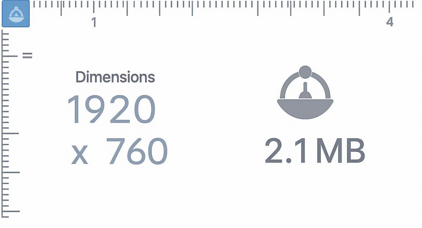
This graphic really drives home the balancing act you have to perform. Choosing the right dimensions is step one, and then managing the file size that results from that choice is step two.
A good rule of thumb is to size your images for the container they'll be displayed in. For example, a common 2025 industry guideline suggests that desktop hero images are typically around 1280 x 720 pixels, which fits the popular 16:9 aspect ratio. For mobile, that same image would shrink down to roughly 360 x 200 pixels. For a blog post image, you might see 1200 x 800 pixels (a 3:2 ratio) on a desktop, which scales down to about 360 x 240 pixels on a phone. You can dive deeper into standard web image sizes and find more great tips over at Oberlo.
Recommended Image Dimensions for Websites
To keep things simple, I've put together a quick-reference table with the ideal pixel dimensions for the most common types of website images.
This guide covers everything from large banners to small thumbnails, providing starting points for both desktop and mobile layouts.
| Image Type | Recommended Desktop Dimensions (Width x Height) | Recommended Mobile Dimensions (Width x Height) | Common Aspect Ratio |
|---|---|---|---|
| Hero Image | 1280 x 720 px | 360 x 200 px | 16:9 |
| Blog Post Banner | 1200 x 800 px | 360 x 240 px | 3:2 |
| E-commerce Product | 1000 x 1000 px | 300 x 300 px | 1:1 |
| Square Logo | 100 x 100 px | 60 x 60 px | 1:1 |
| Thumbnail | 300 x 300 px | 90 x 90 px | 1:1 |
Keep in mind, these numbers are excellent starting points, but the perfect dimensions can shift a bit depending on your website's specific theme and design. It's always a good idea to check your theme's documentation for the most precise recommendations.
Getting these dimensions right from the very beginning will save you a ton of headaches down the road. If you need to resize your images to fit these guidelines, a simple online image resizer can help you set the perfect width and height in seconds, no complicated software needed. This ensures every image is perfectly tailored for its designated spot, preventing awkward cropping and keeping your site looking polished on every device.
How to Reduce Image File Size Without Losing Quality
So you've got your image dimensions dialed in perfectly. Great. But there's one last, crucial step: tackling the file size. This is the "weight" of your image, and it's the number one culprit behind slow-loading websites. Nothing sends visitors running for the back button faster than a page that just won't load because it's bogged down by heavy images.
When it comes to web performance, file size is everything. A good rule of thumb is to keep most web photos under 200 KB. For smaller graphics like thumbnails, you should aim even lower, targeting under 80 KB.
Believe it or not, enormous, uncompressed images can make up over 60% of a webpage’s total weight. The impact is real—even a tiny 1-second delay in page load time can slash conversions by 7%.
Understanding Image Compression
The secret to shrinking an image's file size is compression. It's a process that cleverly reduces the data in an image file without making it look terrible.
Think of it like making concentrated juice from a pile of fresh fruit. You remove the water (the unnecessary data) to create a smaller, lighter package, but you keep all the essential flavor (the visual quality).
There are two ways to go about this:
- Lossless Compression: This technique shrinks the file by removing non-essential metadata from the file. It doesn't touch the actual image pixels. It’s like tidying up a messy room—the important stuff is still there, untouched, but you’ve cleared out the clutter. The file size reduction is modest, but you lose zero quality.
- Lossy Compression: This is the more powerful approach. It analyzes the image and permanently discards redundant or less noticeable visual data. You sacrifice a tiny bit of quality—often so little the human eye can't even spot the difference—in exchange for a massive drop in file size. This is the sweet spot for most web photos.
Mastering these methods is a game-changer. Our guide on https://quickpixel.co/blog/how-to-compress-images breaks down the techniques that will get your site flying.
Choosing the Right File Format
The format you save your image in also has a huge impact on its final size. Different formats use different compression methods, making them better suited for certain jobs.
Selecting the correct format is not just a technical detail; it's a strategic decision. It directly influences the balance between image quality, file size, and the overall speed of your website.
Here's a quick rundown of the big three:
- JPEG (or .jpg): This is your workhorse for photographs and any complex images with millions of colors. Its lossy compression is fantastic for getting tiny file sizes with almost no visible loss in quality.
- PNG (.png): Choose this for graphics, logos, and icons, especially if you need a transparent background. PNG uses lossless compression, which means it keeps every single detail sharp, but the files are usually larger than JPEGs.
- WebP (.webp): This is the modern format from Google, and it's the best of both worlds. It offers incredible lossy and lossless compression. On average, WebP files are 25-35% smaller than their JPEG or PNG counterparts without sacrificing quality. If you can use it, you should.
Once you get a handle on image size, you can take what you've learned and apply it to your broader optimization strategy. This is a core part of learning how to improve website loading speed.
Getting Platform-Specific With Your Image Sizes
https://www.youtube.com/embed/WaFi4TjrHjI
While the core ideas behind optimizing images are pretty universal, the "best" size really boils down to where you're putting them. Every platform, whether it's a CMS like WordPress or an e-commerce powerhouse like Shopify, has its own quirks and recommended dimensions. Nailing these platform-specific sizes is the secret to making sure your images look crisp and slot perfectly into your site’s design.
You might have noticed that many of these platforms automatically resize your images when you upload them, creating different versions for thumbnails, galleries, and so on. But don't let that fool you into thinking you can just dump a massive file and call it a day. Giving the system a well-sized, pre-compressed image is like giving a chef high-quality ingredients—the final result is always going to be better.
Sizing for Shopify and WordPress
Different platforms have different priorities, and that's reflected in their image guidelines. Shopify, for example, is all about showing off products. They suggest you can go as high as 2048 x 2048 pixels for your product photos to get that beautiful, detailed zoom effect. But, they also push you to keep the file size under 300 KB to keep your store zippy.
Over in the WordPress world, things are a bit different. Many themes are designed for blogging and content, so you'll often see recommendations for featured images around 680 x 382 pixels, which fits a standard 16:9 aspect ratio. Sticking to these guidelines helps you avoid that dreaded awkward crop and keeps your site looking polished and professional.
Even though these platforms do a lot of the work for you, a little manual effort goes a long way. Taking a minute to resize and compress your images before you hit "upload" gives you complete control over how they look and perform.
Beyond Websites: App Stores and Marketplaces
This idea of platform-specific sizing goes way beyond your own website. Every digital marketplace has its own rulebook. If you're building a mobile app, for example, getting your visuals right is crucial. Diving into the details of Mastering App Store Screenshot Sizes can make a real difference in how many downloads you get.
The same goes for selling on sites like eBay. To make sure your products look their best and meet all the requirements, you'll want to follow their specific guidelines. We've actually put together a whole guide on the ideal eBay photo size to help sellers get it right.
The big takeaway here is simple: one size rarely fits all. Before you start uploading images, always take a moment to check the official recommendations for whatever platform you're on. It’s a small step that ensures your visuals have the biggest possible impact.
Ultimately, the goal is to show the perfect image to the right person on the right device. More advanced web design techniques, like using the srcset attribute in your HTML, let a user's browser pick the best-fitting image from a set of options you provide. This is what truly creates a fast, responsive experience for every single visitor.
Common Questions About Website Photo Sizes
Even after you get the hang of the basics, a few specific questions always seem to pop up when you start putting these ideas into practice. Let's tackle some of the most common ones I hear about getting photo sizes just right for a website.
What Resolution Should My Website Images Be?
This is a classic, and thankfully, the answer is simpler than it seems. When it comes to the web, you can pretty much forget about traditional print metrics like DPI (dots per inch). Your screen displays everything at a standard resolution, which is usually around 72 PPI (pixels per inch).
Uploading an image at 300 DPI (a common print standard) won't make it look any sharper on a screen. All it does is make your file size unnecessarily large.
What really matters are the pixel dimensions—the actual width and height of the image in pixels. Your goal is to match the width of your image to the container it's going into on your website. If your blog's main content column is 800 pixels wide, you should aim to make your image 800 pixels wide. Simple as that.
One pro tip: for super-sharp displays like Apple's Retina screens, it’s a great practice to upload an image that's twice the size of its container. So, for that 800-pixel space, you’d use a 1600-pixel wide image. This gives those high-resolution screens extra detail to work with, making your images look incredibly crisp.
Can a Photo Be Too Small for a Website?
Absolutely, and this is a mistake you really want to avoid. When you upload a photo that's smaller than the space it needs to fill, the browser has no choice but to stretch it. This is called upscaling, and it's the fastest way to get a blurry, pixelated, and unprofessional-looking image.
Think of it like trying to stretch a tiny passport photo to fit a giant billboard. It would be a distorted mess, right? The same thing happens on your website.
The golden rule is this: always start with an image that is at least as large as the biggest size it will ever need to be. A browser can shrink a large image down beautifully, but it can never scale a small image up without ruining it.
How Do I Find the Best Image Size for My Website Theme?
Figuring out the perfect dimensions for your specific theme can feel like a bit of a treasure hunt, but there are a couple of surefire ways to get the exact numbers you need.
The easiest path is to check your theme’s official documentation. Most good theme developers provide a style guide or setup instructions that spell out the recommended image sizes for logos, banners, and featured images. This is always your most reliable source.
If you can’t find the documentation, don’t worry. Your web browser has a handy built-in feature that can do the trick: the 'Inspect' tool.
- Navigate to a page on your site that has the image spot you're trying to fill.
- Right-click on the image (or the placeholder where it goes) and choose "Inspect" from the dropdown menu.
- A developer panel will slide open. As you move your mouse over the image’s code in that panel, your browser will highlight it on the page and show you its exact dimensions in pixels.
This little trick tells you the precise size of the container, giving you the perfect target to aim for with your image. Once you learn this, you can make sure your photos fit flawlessly into your design every single time.
Stop wasting time on complicated photoshoots. With QuickPixel, you can transform simple phone pictures into stunning, professional product images that drive sales. Just upload your photos, and our AI-powered service will handle the lighting, backgrounds, and editing for you. Get your studio-quality product photos today at https://quickpixel.co.
Try QuickPixel Today
Get started with our AI-powered image generation tools