How to Improve Ecommerce Conversion Rates Quickly
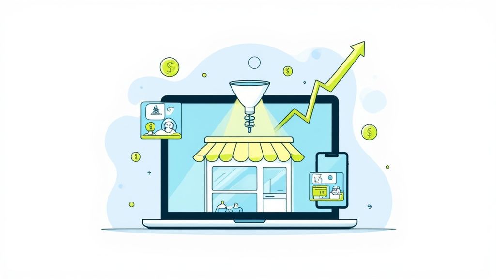
Before you can boost your e-commerce conversion rates, you need a solid starting point. It’s about creating a data-driven baseline by digging into your own metrics and then methodically improving your product images, user experience, and trust signals. This ensures you’re not just making random changes, but focusing your energy on the weak spots where you’re losing customers.
Establishing Your Baseline for Smarter Optimization
Jumping into conversion optimization without knowing your numbers is like trying to navigate a new city without a map. You might wander around and see some things, but you’ll have no idea if you’re actually getting closer to your destination. The first real step is to get a crystal-clear picture of where you stand right now. This isn't about hitting some vague global average; it’s about understanding what success looks like for your business.
Every online store has its own unique ecosystem. A 2% conversion rate might be phenomenal for a high-ticket furniture retailer with a long sales cycle, but for a fast-fashion brand, that same number could be a red flag. Context is everything.
Know Your Industry Benchmarks
Before you start tweaking your site, it helps to see how you measure up against the competition. Knowing the lay of the land gives you a realistic target to aim for.
To put this into perspective, let's look at some recent industry benchmarks. Seeing how conversion rates vary can help you set realistic goals for your store.
Ecommerce Conversion Rate Benchmarks by Industry
A comparison of average conversion rates across different ecommerce sectors to help you benchmark your store's performance.
| Industry | Average Conversion Rate (%) |
|---|---|
| Personal Care | 6.8% |
| Food & Beverages | 4.9% |
| Electronics | 3.6% |
| Fashion, Jewelry, & Shoes | 1.9% |
| Home Decor & Furniture | 1.4% |
These numbers, based on 2025 data, show just how much performance can differ from one niche to another. You can always explore more industry-specific ecommerce conversion rate data to find where your business fits in.
This kind of data is a practical yardstick. If your home decor store is converting at 1.5%, you're actually doing better than average. That means you can shift your focus from a complete overhaul to making smaller, incremental improvements.
Dig Into Your Own Analytics
While benchmarks are useful for context, the most important data comes from your own analytics platform, like Google Analytics. This is where you move beyond industry averages and get personal with your performance. The goal here is to spot patterns and pinpoint the exact friction points in your sales funnel.
Start by getting answers to these core questions:
- What's my overall conversion rate? This is your north-star metric. Simply divide your total number of sales by your total number of website visitors.
- How do different devices perform? It’s incredibly common to see high mobile traffic but much lower conversion rates compared to desktop. A big gap here is a classic sign of a clunky mobile experience.
- Which pages have the highest exit rates? Are people bailing from certain product pages, the shipping info page, or right at the first step of checkout? This tells you exactly where to direct your attention.
This chart visualizes how these metrics might look for a typical store, highlighting a clear gap between desktop and mobile performance, along with a significant cart abandonment rate.
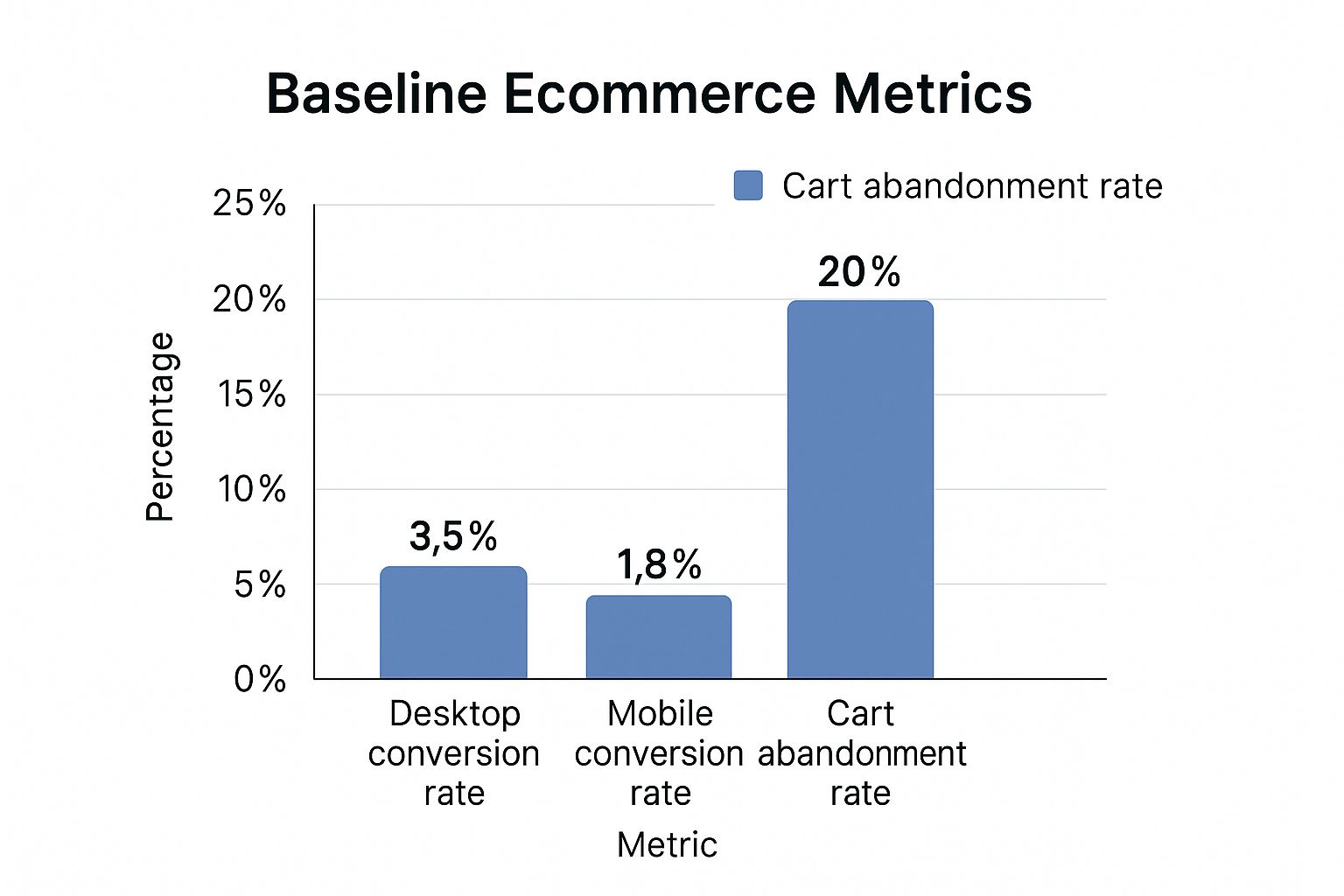
The data here tells a story: while desktop users are converting at a decent rate, the mobile experience is a major bottleneck that’s costing sales and needs immediate work.
By establishing this clear, data-backed baseline, you’re turning your optimization efforts from a guessing game into a focused, scientific process. You can set achievable goals, prioritize the changes that will actually move the needle, and measure your success with confidence. This foundational work is what separates the stores that plateau from the ones that achieve real, sustainable growth.
Turning Product Images Into Your Best Salespeople
In an online store, your product photos do the heavy lifting. Think about it: customers can't pick up your products, feel their weight, or examine the texture. Your images have to do all of that for them. They're not just pictures; they're the bridge between a potential customer's curiosity and their confidence to click "Add to Cart."

This isn’t just about having a few clear shots. It's about building a visual story that answers a customer’s unspoken questions, highlights the real value of an item, and helps them see it fitting perfectly into their life. When your photos get this right, hesitation melts away, and the sale becomes almost inevitable.
Nail the Professional and Consistent Look
Consistency is the bedrock of a brand that feels trustworthy. When every product photo on your site shares a similar vibe—be it the lighting, the background, or the editing style—it creates a seamless and professional experience. It tells shoppers you care about the details.
This doesn't mean you need a five-figure studio setup. A store selling handmade jewelry, for instance, should shoot every necklace and ring against the same neutral backdrop. The lighting should be consistent, making sure the silver gleams and the gemstones sparkle just right in every shot. This visual harmony makes your entire collection feel curated and high-quality. You can find some great pointers for affordable product photography that still look a million bucks.
Use Lifestyle Photos to Tell a Compelling Story
Clean, white-background shots are non-negotiable for showing off the product itself. But lifestyle photos? That's where you make an emotional connection. These are the shots that place your product in a real-world setting, helping customers truly imagine owning it.
A shopper isn’t just buying a backpack; they’re buying the promise of adventure. A photo of that durable, waterproof bag on a misty mountain trail is infinitely more persuasive than seeing it floating in a white digital void.
Always try to show the end benefit.
- Selling a dress? Show it on a model at a sunny outdoor brunch, not just on a mannequin.
- Have a unique vase? Display it on a styled bookshelf, showing how it completes the room.
- Kitchen gadget? Feature someone laughing as they use your blender to make a delicious smoothie.
These scenes are powerful because they shift the customer’s mindset from "looking at a product" to "imagining my life with this product."
Show Every Angle and Get Up Close
What’s the biggest killer of a potential sale? Uncertainty. Will my laptop fit in that bag? What does the stitching on that couch really look like? Your image gallery is your best weapon against these doubts.
A great product gallery should work like a visual FAQ, answering questions before the shopper even has to ask. Providing multiple, detailed views isn't a nice-to-have; it's essential for building the confidence needed to make a purchase.
Here's a quick checklist for a killer product gallery:
- The Hero Shot: Your main image. Clear, well-lit, and on a clean, simple background.
- Multiple Angles: Don't just show the front. Give them the back, sides, top, and even the bottom if it’s relevant.
- In-Context Shot: The lifestyle photo that shows the product in its natural habitat.
- Detailed Close-Up: Zoom in on what makes your product special—the texture of the fabric, the detail in the woodwork, the quality of the zipper.
- Scale Reference: Show the item next to something familiar (like a phone or a person) to give a clear sense of its true size.
- 360-Degree View: If you can swing it, an interactive 360-degree photo is the next best thing to holding the product in their hands.
When you treat your product photography as a central part of your sales strategy, you give shoppers all the visual proof and emotional context they need to go from just browsing to happily buying.
Smooth Out the Path to Purchase
Think about the last time you abandoned an online shopping cart. What was the final straw? A confusing menu? A surprise shipping fee? Maybe you just got tired of filling out endless forms on your phone.
Every one of those moments is a point of friction. It’s a tiny obstacle that, when added up, makes a customer decide, "It's not worth it." Your job is to find and eliminate every single one of those friction points, making the journey from browsing to buying completely seamless.
The best user experience is one the customer barely notices. They find what they need, pop it in their cart, and pay without ever hitting a snag. It feels easy, intuitive, and natural.
Make Finding Products a Breeze
A sale can't happen if the customer can't find the product. This sounds obvious, but so many sites get it wrong with cluttered navigation or a search bar that just doesn't work well. You need to guide people where they want to go without making them think too hard.
For instance, if someone is looking for "black running shoes," your site should offer a crystal-clear path, like a menu that flows from "Shoes" to "Running." More importantly, your search bar should instantly pull up the right products and provide smart filters for size, brand, and price. You're reducing the mental effort required to shop.
Here are a few quick wins for better product discovery:
- Simplify your main navigation. Don't overwhelm visitors. A clothing store can get by with "Men," "Women," "Kids," and "Sale." You can always use sub-menus for more specific categories.
- Offer smart filters. Let people narrow down their options by what actually matters to them, like color, size, material, or customer ratings.
- Use great thumbnails. Your category page images need to be sharp, consistent, and give a clear preview of the product at a glance.
Design for the Mobile Majority
Let's be real: most of your customers are probably shopping on their phones. A mobile-friendly site isn't just about your desktop design shrinking to fit a smaller screen. It demands a completely different approach—one built for thumbs, small displays, and short attention spans.
Every single element has to be re-evaluated for mobile. Are your buttons big enough to tap? Do your forms automatically pull up the number pad for a phone number field? A clunky mobile experience is a guaranteed way to lose a sale in seconds.
A great mobile design understands that the user might be multitasking. The whole process should be so smooth they can complete an order while waiting in line for their morning coffee.
Rebuild Your Checkout from the Ground Up
The checkout is where the magic happens—or doesn't. It's the final hurdle, and it's where an astonishing number of sales fall apart. Cart abandonment is a massive challenge for e-commerce stores, with global rates expected to hit 71.3% in 2025. On mobile, that number jumps to a staggering 77.2%.
The crazy part is that the top reasons for abandonment are almost always fixable problems within the checkout flow. You can see more e-commerce benchmark data that shows just how impactful these small tweaks can be. Your checkout needs to be a masterclass in simplicity and trust.
Here’s what every high-converting checkout needs:
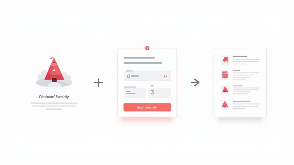
- Offer guest checkout. Forcing someone to create an account is one of the biggest conversion killers out there. Make guest checkout the most prominent, easiest option.
- Show a progress bar. Let shoppers know exactly where they are in the process (e.g., Shipping > Payment > Confirmation). It manages expectations and keeps them moving forward.
- Be upfront about all costs. Surprise shipping fees are the number one reason people abandon carts. Show every single cost, including taxes and shipping, as early as possible.
- Keep forms short and simple. Only ask for the information you absolutely need. Use tools like address auto-fill to save your customers from tedious typing.
- Provide multiple payment options. Don't lose a sale just because you don't offer a customer's preferred way to pay. Include major credit cards, PayPal, Apple Pay, and Google Pay to cover your bases.
By getting rid of these common roadblocks, you create a path to purchase that feels less like an obstacle course and more like a welcome mat.
You Can’t Make a Sale Without Customer Trust
In e-commerce, trust is the currency that drives every single sale. It's not just a nice-to-have feature; it's the bedrock of your business. When someone lands on your site, they're immediately, often subconsciously, looking for signs that you're a legitimate, professional, and reliable store. If those signals are missing, even the most amazing product will fail to convince a skeptical visitor.
Building this kind of unbreakable trust isn't about slapping a generic security badge in your footer and calling it a day. It’s about carefully weaving credibility into every part of the customer's journey, from the first click all the way through to the final checkout step.
Show Them They’re Not the First
Nothing calms a nervous shopper’s mind faster than seeing that other people have already bought from you—and loved it. This powerful psychological trigger is called social proof, and it's one of your best tools for boosting conversion rates. Positive reviews and high ratings instantly reduce the perceived risk and give shoppers the validation they need to click "buy."
Don't bury your reviews on a forgotten page. Sprinkle them where they'll have the most impact. I’ve seen huge lifts from placing a few glowing testimonials directly on the homepage and making sure star ratings are featured prominently right under the product title.
Another fantastic form of social proof is user-generated content (UGC). A product looks so much more real in a customer's hands than it does in a polished studio shot. Encourage your customers to share photos on social media with a unique hashtag, then curate the best ones into a gallery on your product pages. It authenticates your brand and helps new shoppers visualize themselves using your products. If you’re worried about brand consistency, a professional product image editing service can clean up UGC to look polished while still feeling authentic.
Get Rid of Checkout Anxiety with Clear Policies
A huge reason for abandoned carts is uncertainty about what happens after the purchase. "What if it doesn't fit?" "What if it shows up broken?" You can eliminate this anxiety by answering these questions upfront with policies that are crystal-clear and easy to find.
Your shipping and return info should never be a mystery. A shopper shouldn't have to leave the product page and go on a scavenger hunt just to find out how much delivery costs.
Make your key policies impossible to miss:
- Shipping: State shipping costs and estimated delivery times directly on the product page or in a prominent site-wide banner.
- Returns: Keep it simple with something like "30-day free returns" displayed clearly, with a link to the full policy for those who want the details.
- FAQs: Build out a truly helpful FAQ page that tackles the most common questions you get about your products, shipping, and returns.
This level of transparency shows customers you have nothing to hide and that you stand behind your products and your service.
Tell Your Story and Be Human
At the end of the day, people buy from people, not from faceless websites. Your "About Us" page is a golden opportunity to create a genuine human connection.
This isn't the place for stiff corporate jargon. Tell your story. Why does your brand exist? Who are the people making it all happen? What's your mission? Sharing your values makes customers feel good about where they're spending their money, turning a simple transaction into something more meaningful. That narrative builds loyalty and gives shoppers a compelling reason to choose you over a soulless competitor every time.
Make Your Site Faster to Keep Customers Happy and Boost Sales
In e-commerce, speed is everything. It’s not just a nice-to-have technical feature; it's a core part of the customer experience. A slow, clunky website doesn't just annoy people—it actively pushes them away and eats into your profits. Every single millisecond you can trim from your load time is a direct investment in your conversion rate.
Think about it like a brick-and-mortar shop. If a customer had to wait at the entrance for five seconds for the door to creak open, then another ten for the lights to flicker on, they’d be long gone before they ever saw your products. The digital world is even less patient. Shoppers want things now, and a sluggish site sends a clear message that you might not be a professional or trustworthy brand.
The Real Cost of a Slow Website
The numbers don't lie: page speed dramatically influences how shoppers behave. Study after study confirms that as load times go up, so does your bounce rate. In fact, a delay of just one to three seconds can increase the chance of a visitor leaving by 32%. That's a third of your potential customers gone before they’ve even had a chance to fall in love with what you sell.
This gets even worse on mobile, where people are often dealing with spotty connections and have zero patience for waiting around. A bad mobile experience is a surefire way to kill conversions, which makes site speed a top priority for any serious store owner.
How to Find and Fix Your Biggest Speed Killers
The good news is you don't have to be a coding genius to make a huge impact. Most slow e-commerce sites fall victim to the same few problems, and they are all fixable.
- Huge, Unoptimized Images: This is the big one, almost every time. You absolutely need high-resolution product photos to show off your goods, but massive file sizes will grind your site to a halt. The trick is striking the perfect balance between image quality and file size. Using a smart image compressor tool can shrink those files down without making your photos look blurry or unprofessional.
- Too Many Apps and Plugins: Every app you install—for pop-ups, reviews, social feeds, you name it—adds extra code that has to be loaded. It all adds up. Do a regular audit of your apps and get rid of anything that isn’t pulling its weight and delivering real value.
- Cheap Web Hosting: If your store is running on a budget shared hosting plan, you’re likely sharing server resources with hundreds of other websites. Once your traffic starts to grow, this becomes a major bottleneck. If you’ve fixed everything else and your site is still slow, it’s probably time to upgrade your hosting.
A one-second delay in mobile page load times can slash conversion rates by up to 20%. This isn't just a minor adjustment; it's a fundamental pillar of a successful online business.
Put Your Mobile Experience First
While optimizing for speed is important across the board, it's an absolute game-changer on mobile. It's common for 73% of e-commerce traffic to come from mobile devices, yet conversion rates are often painfully low. You'll often see desktop users converting at around 4.8%, while mobile users lag behind at just 2.9%. This gap is a massive opportunity waiting to be seized. If you want to dig deeper, you can find more great stats on e-commerce conversion rates on Network Solutions.
To close that conversion gap, you have to think mobile-first. This means your site shouldn't just be "responsive"—it needs to be genuinely fast and effortless to use on a small screen. By tackling those speed bumps, especially heavy images and clunky code, you create a seamless shopping experience that encourages every visitor to become a customer, no matter what device they're on.
Adopting a Mindset of Continuous Improvement
The secret to a high-performing store isn't about finding one magic bullet. It’s about realizing that conversion optimization is a marathon, not a sprint. You don't just "fix" your conversion rate and move on. Instead, you build a culture where every single change is a chance to learn more about your customers and systematically make their experience better.
This isn’t about huge, risky overhauls that could tank your sales overnight. It’s about making small, calculated tweaks and actually measuring what happens. This process, known as A/B testing (or split testing), is the engine that drives sustainable growth. It pulls you out of the world of guesswork and into the realm of data, letting you make confident decisions that truly move the needle.
From Educated Guess to Data-Backed Decision
At its core, A/B testing is beautifully simple. You take one element on your site—let's say a product page button—and create two versions. Version A is what you have now (the control), and Version B is your new idea (the challenger). You show each version to a different segment of your audience and see which one gets more people to convert. The winner is clear.
Every good test starts with a solid hypothesis, which is really just an educated guess about what you think will happen. A great hypothesis always follows this simple structure:
"If I change [X], then [Y] will happen, because [Z]."
For example, you might hypothesize: "If I change the 'Buy Now' button color from grey to a vibrant orange, then more people will click it, because the color will pop against our white background." This framework gives your test a clear purpose and a specific outcome you can measure.
Uncovering How Users Really Behave
To come up with strong hypotheses, you have to get inside your users' heads and see where they're getting stuck. This is where user behavior tools are an absolute game-changer. They give you a window into how people actually interact with your store.
- Heatmaps: Tools like Hotjar or Crazy Egg are fantastic for this. They create a visual map showing where people click, how far they scroll, and where their mouse hovers. You might discover that a critical link is getting ignored simply because it's buried below the fold where 75% of your visitors never scroll.
- Google Analytics: This is your command center for hard numbers. Dive in to see which pages have alarmingly high bounce rates or where people are abandoning your checkout process. This data points you directly to the biggest leaks in your sales funnel.
By combining what you see in a heatmap with the numbers from Google Analytics, you can stop testing random ideas and start running targeted experiments that solve real problems.
As the e-commerce space gets more crowded, the brands that win are the ones that constantly test, learn, and adapt. Committing to this process is one of the most reliable ways to build a long-term competitive advantage. You can discover more ecommerce insights on SellersCommerce and see how the top players stay ahead. When you foster a culture of constant learning, your store stops being a static website and becomes a dynamic system that gets smarter with every single visitor.
Common Questions About Boosting Conversions
When you start digging into conversion optimization, a few questions always seem to pop up. Let's tackle them head-on so you can focus your energy on what truly moves the needle.
What Is a Good Ecommerce Conversion Rate?
Honestly, there's no single magic number. A "good" conversion rate is all about context. While you'll often hear the global average is around 2-4%, what really matters is how you stack up against others in your specific niche.
For instance, if you sell home decor, where the industry average hovers around a tough 1.4%, hitting a 3% conversion rate is a massive win. But for an electronics store, where the benchmark is closer to 3.6%, that same 3% would be just okay.
The best approach? Stop chasing a universal number. Instead, focus on consistently outperforming your own baseline and your industry's average.
How Quickly Will I See Results?
This really depends on the scale of the change you're making. Some tweaks can deliver a noticeable lift almost immediately, while others are more of a long game.
A simple A/B test on your call-to-action button—maybe changing the color or wording—can show you a measurable difference in just a week or two. On the flip side, a full-site redesign is a massive undertaking that could take months before you can truly gauge its impact.
The trick is to isolate your variables. Test one significant change at a time. That way, you know for certain what caused the bump (or dip), giving you solid data to inform your next move.
What Change Has the Biggest Impact?
Every store has its own unique friction points, and your own analytics are the best place to start looking for them. Find your biggest bottleneck, and you've found your biggest opportunity.
That said, after years of doing this, I've seen a few areas that almost always deliver a big return on investment:
- Upgrading your product photos. We're talking clear, professional, detailed images that anticipate and answer a shopper's questions before they even have to ask.
- Smoothing out the checkout process. Friction here is a conversion killer, especially for mobile users who are notoriously quick to abandon a clunky cart.
- Boosting your site speed. In a world of instant gratification, every millisecond counts. If your site is slow, shoppers will bounce before your products even load.
If you're wondering how to improve ecommerce conversion rates in a meaningful way, focusing on these three pillars is one of the most reliable strategies out there.
Ready to see how much your product imagery is really holding you back? With QuickPixel, you can turn your standard photos into high-converting, studio-quality shots that build trust and drive sales. Get your professional product photos today.
Try QuickPixel Today
Get started with our AI-powered image generation tools